Since starting at NetEngine I’ve been challenged to optimise my work environment, including my shell.

I’m not a fan of heavy customisation. Previously, I worked across many different machines and so I stuck to plain old bash and vim for any terminal work. I’ve avoided heavy customisation of my dotfiles, or using someone else’s customisation.

Now that I’m working from one machine everyday there’s a few features I wanted to have:

  1. tabbing for everything (e.g. git checkout )
  2. smart history (type a command and then press up to cycle through previous commands of just that type)
  3. useful git information at my prompt

These things are easy enough to add to bash or zsh and I started doing this, but one weekend I decided to give fish a go.

fish is a fully-equipped command line shell (like bash or zsh) that is smart and user-friendly. fish supports powerful features like syntax highlighting, autosuggestions, and tab completions that just work, with nothing to learn or configure.

If you use Homebrew, installing is simple:

# install fish
brew install fish

Homebrew will tell you what to do next:

# use fish
sudo echo /usr/local/bin/fish >> /etc/shells
chsh -s /usr/local/bin/fish

Once you have it working:

# learn fish
help

What’s to like

It includes the things I listed above out of the box. It also includes a few extra features I didn’t realise I would appreciate until I started using them.

Syntax highlighting

This isn’t just fancy wording for colour. This is colour that changes, and tells you things, as you type.

For example, If you you’ve typed an invalid command it displays as bold and red until corrected, saving you from the mild embarrassment of command not found

Autocomplete

As you are typing a command, fish will guess the command you want and display it after your curser in grey. Ignore it, or hit the right arrow to finish the command. I use this more than accessing the history or tabbing.

Documentation

I think if I can read a product’s documentation standing on one leg, on a train, on a 5 year old phone, and continue to enjoy myself, then it’s a win.

Seriously, run help.

Web based config

This is a weird one. Run fish_config and a web page will open allowing you to change colours, choose a preset prompt, view functions, delete history.

The range of preset prompts to choose from is just about right.

Settings are stored in ~/.config/fish/config.fish.

What’s the catch?

(see what I did there?)

It’s not POSIX compatible. This means that not everything that works in bash or zsh will work in fish.

Some of the syntax in fish is different to bash. It’s cleaner and a bit ruby-esque.

RVM

I use RVM to manage my ruby versions. It didn’t work straight away. The RVM site has some helpful information: https://rvm.io/integration/fish

This gist mentioned on the RVM site works best.
https://gist.github.com/eggegg/6077153

However, because of its cd trickery, RVM auto-switching still doesn’t work. This isn’t a major problem I get around it by switching manually rvm use ...

Or; I could switch to another ruby version manager. fry: a simple ruby version manager for fish

That random script you copied and pasted from stack overflow.

One day I tried to do something like this.

echo $(date +”%m_%d_%Y”)

then fish nicely yelled at me and told me how I could do better.

fish: Did you mean (COMMAND)? In fish, the ‘$’ character is only used for accessing variables. To learn more about command substitution in fish, type ‘help expand-command-substitution’.

Starting a bash session when you need it is easy enough. I think I’ve only reverted to that once.

Conclusion

I wouldn’t go installing fish everywhere, and I will continue write shell scripts for bash. However, for interactive everyday use, I think it’s a win.

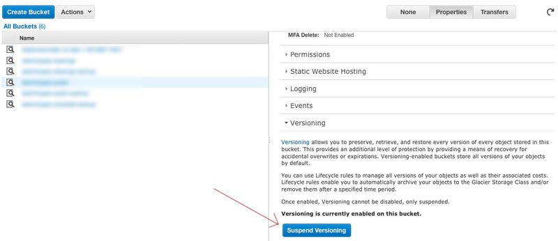
We recently wanted to remove an Amazon S3 bucket where 1,000,000+ files were stored. This bucket also had versioning enabled which means the actual number of files was way bigger. To give us an idea, we dump the file paths to delete: the associated output text was 500MB big.

This task which seems simple at first proved to be quite complicated to handle, mostly because of Amazon own limitations that it would be nice to see addressed.

The first thing we had to do is obviously to disable versioning in the Amazon Web Services console:

Without this, not only the bucket would not be emptied but some delete markers would be added to the bucket which would make our life even harder.

The first assumption a user has when wanting to delete a S3 bucket is that clicking on Delete Bucket works. But Amazon does not allow to delete a non empty bucket.

Emptying the bucket through the Amazon Console does not work either when the bucket contains more than 10,000 files. And this is where the troubles begin: simply listing the files to delete ends up crashing the most popular S3 tools like s3cmd.

We found some really interesting scripts which are designed to delete both delete markers and all file versions on a S3 bucket. These scripts were indeed deleting the files on our S3 bucket but kept on running after four days in a row.
The main reason for this is that a query is made for each file deletion. We needed to perform some bulk delete instead.

Amazon CLI provides the capacity to delete up to 1000 files using a single HTTP request via the delete-objects command.

We engineered a ruby script which relies on this command to delete our files faster:

Pre-requisites:

To use this script you need to:

  • Export your Amazon credentials: export AWS_ACCESS_KEY_ID=... and export AWS_SECRET_ACCESS_KEY=...
  • Have the Amazon CLI installed.
  • Have a Ruby interpreter installed.
  • Download the above file and make it executable: chmod +x FILE

Usage:

Simply execute the script like any other programs with the bucket name you would like to empty as the argument.
E.g: Providing the Ruby script was called S3_bucket_cleaner.rb:

./S3_bucket_cleaner.rb BUCKET_NAME

Figures and conclusion:

The above script was able to remove all the files of our S3 bucket in less than 20 min which was good! It would be great if Amazon let people emptying / removing a S3 bucket regardless how full this one is. In the meantime, we are happy to share this script with you today in case you run into a similar scenario.

When projects grow they become hard to change. One aspect that is not often highlighted is dependency direction. I haven’t found much material on the topic, maybe the best ideas came from this talk by Sandi Metz “Less, the path to a better design”.

Some of the main points of Sandi’s talk

The purpose of design is to reduce the cost of change, anything else is not design.
Managing dependencies is at the heart of design.

According to the Stable Dependencies Principle

[The dependency] should be in the direction of the stability.
“Stable” roughly means “hard to change”

But then:

if you don’t know what types of changes are likely, it is best to wait and see what happens as the system evolves.

Sandi’s main point in her talk is that dependency direction is a choice, and:

[17:55] Uncertainty is not a license to guess, it’s a directive to decouple.

And the last pill of wisdom:

Don’t guess what changes will come, guess what will change.

Which, quickly explained here, is about applying the open / closed principle when the code you’re writing might change.

Every class used in your application can be ranked along a scale of how likely it is to undergo a change relative to all other classes.

  • Sandi Metz POODR, Chapter 3, pg 54

My suggestions to choosing navigability

The class diagram of the app can express navigability with the slim arrow (->). The navigability determines the dependency direction. When in doubt about a dependency direction, we can follow the class diagram.

  • If Post belong_to User, User owns Post, the navigability is Post -> User and you should consider favouring depending on User in Post, rather than the other way around;
  • Ask yourself: “Can Post exist without User?” (and vice-versa); User makes sense even without Post, but it’s unlikely that a Post can exist without a User, so the navigability should be Post -> User;
  • Avoid User <-> Post, if you do it you will be unable to use User without a Post and vice-versa;
  • Classes with many associations should not hold methods about them; Failing to do so will break the SRP;
  • Divide your application into modules, and apply strict dependency direction between modules; E.g.: Reports -> Users means strictly no methods like user.daily_report;
  • Add the dependency to the lower level object, so that the parent stays clean. This spreads the logic more evenly in classes who are usually more specific about the logic being added.

An example

    ######################
    # Less stable solution
    class Controller
      def action
        purchase.cost
      end
    end

    class Purchase
      has_many :line_items, inverse_of: :purchase

      # `cost` is an external dependency
      def cost
        line_items.sum(:cost)
      end
    end

    class LineItem
      belongs_to :purchase, inverse_of: :line_items
    end

    ######################
    # More stable solution
    class Controller
      def action
        LineItem.total_cost_of(purchase)
      end
    end

    class Purchase
      has_many :line_items, inverse_of: :purchase
    end

    class LineItem
      belongs_to :purchase, inverse_of: :line_items

      # Only dealing with internal dependencies
      def self.total_cost_of(purchase)
        where(purchase: purchase).sum(:cost)
      end
    end

Most projects will have two god classes: User and whatever the focus happens to be for that application. In a blog application, it will be User and Post. – Thoughtbot, How much should I refactor

Instead of having a class User that knows about a bunch of unrelated concepts like posts, notifications, friends etc, you can easily picture a small User class that other resources depend on.

Conclusion

Either you do or don’t agree with this idea, I hope we all agree that choosing the dependency direction is an important factor to improve an app maintainability.

Dependency direction is a choice, and whether you noticed it or not, you just made one

  • Sandi Metz

This post is overlooking dependency injection, interfaces stable dependency principle on purpose.

Further readings:

This month we started a weekly newsletter to share articles we’ve liked, apps that are making our lives easier and new developments in tech. The following is what we’ve loved in June. If you’d like to sign up to the newsletter you can do so here


Zoom.us

zoom us

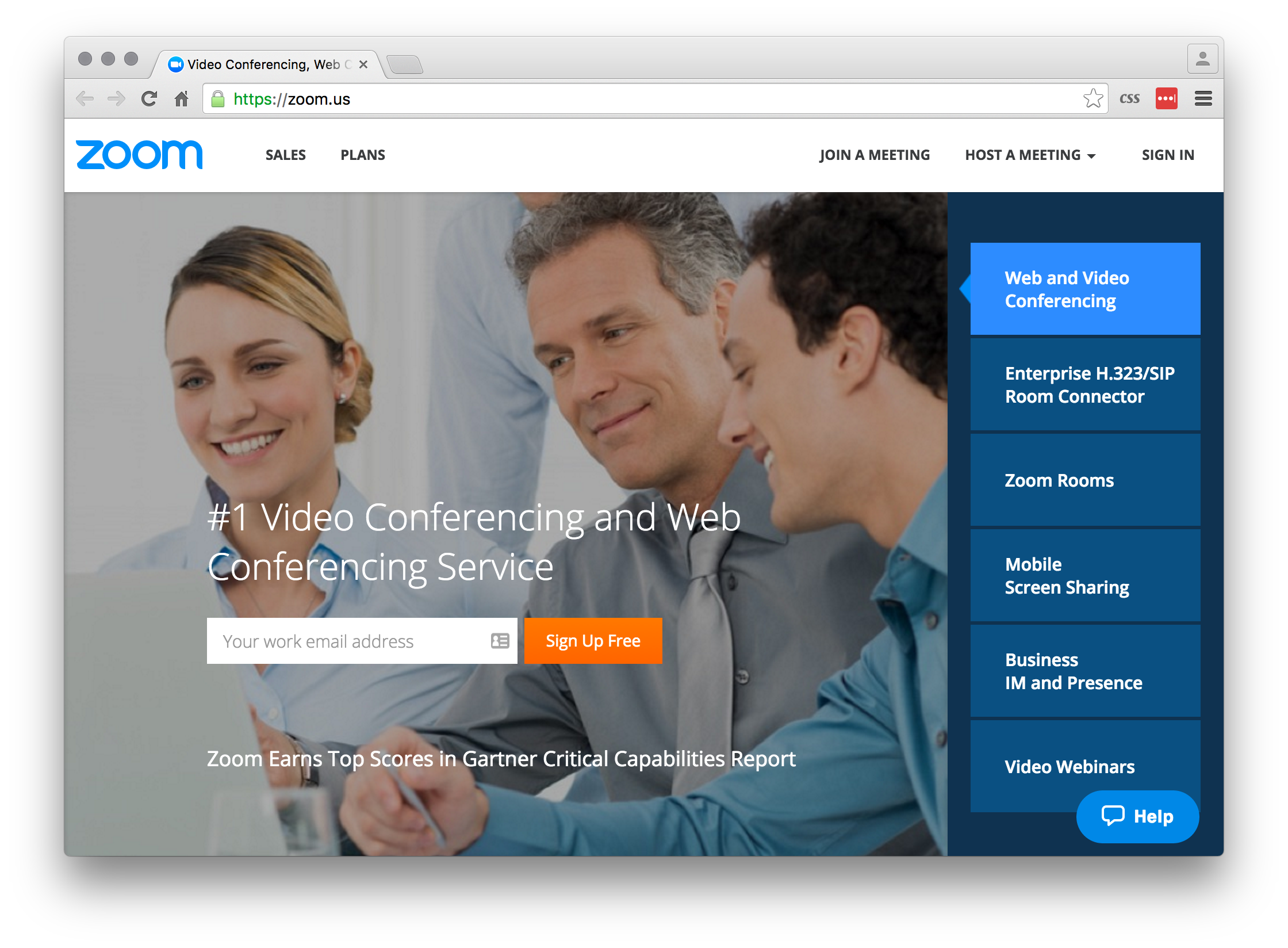
“If you have got an invite from me over the past few weeks you might notice I am now using [Zoom.us] (http://zoom.us/) for video and phone meetings. I have found that this service works far more reliably than GoToMeeting, Skype, Google Hangouts or JoinMe and I am super excited by how fast and easy it is to have meetings. There is a great free plan and I would highly recommend this service to anyone who needs to host meetings with people in multiple locations.”

Matt


Kraken.io/web-interface

kraken io

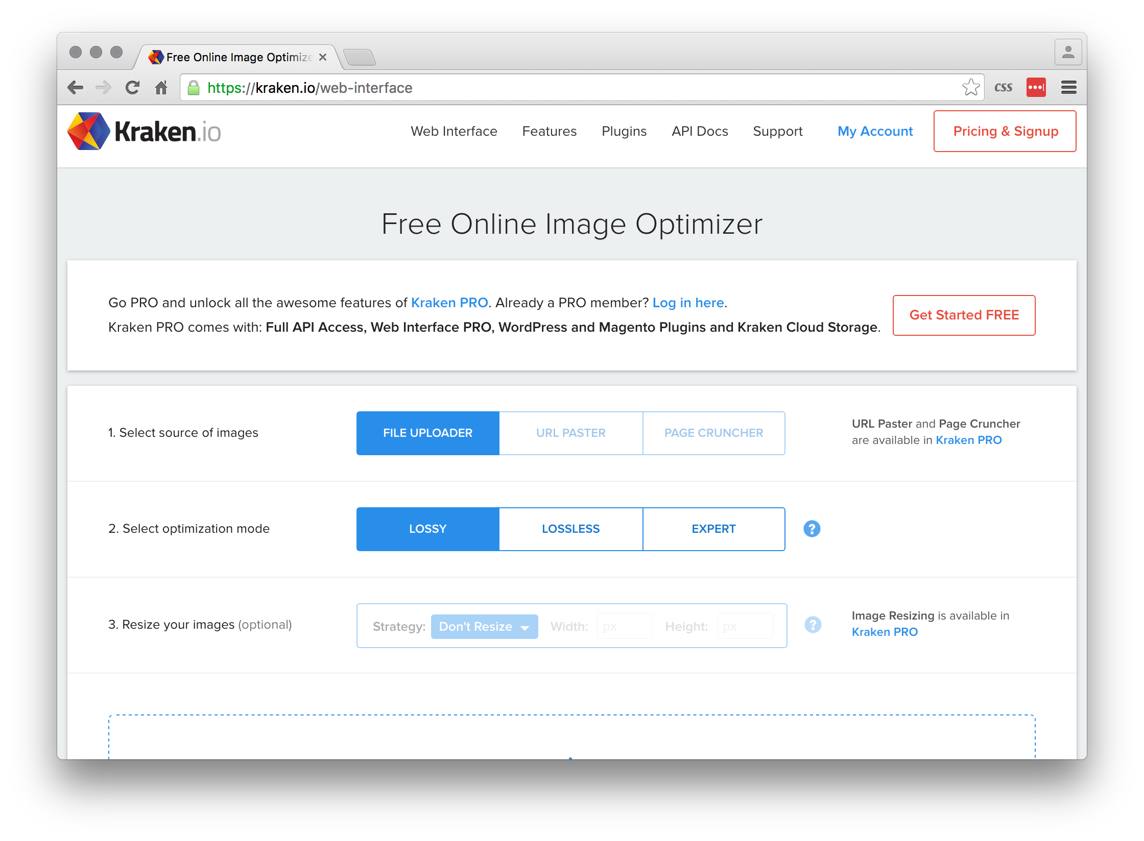
“Many of our products already optimise the images you upload. But, if you’re creating some media rich content without a tool designed specifically for the web, you should consider [this image optimiser] (https://kraken.io/web-interface) and your images will be loaded more quickly without affecting their quality. A quick user experience is a good user experience.”

Erik


Random Hacks of Kindness

Rhok

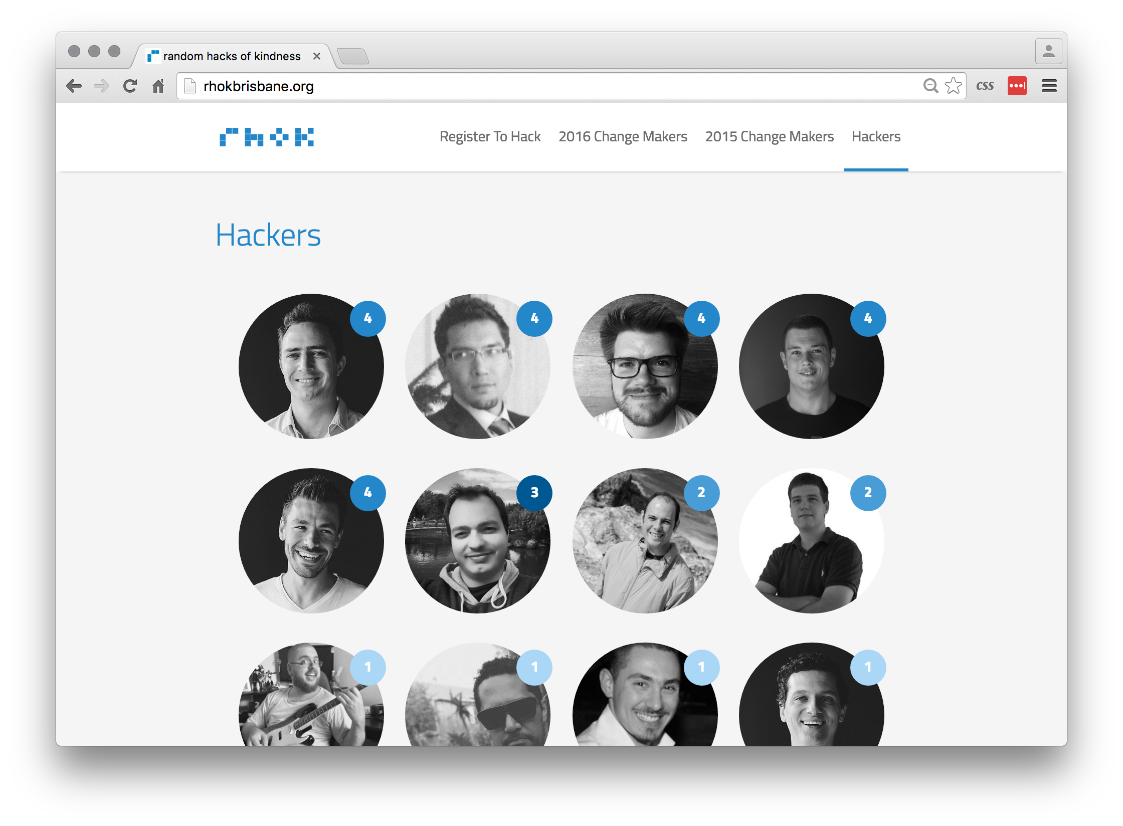
“This weekend we are heading to QUT’s beautiful Garden’s Point for the Winter 2016 Random Hacks of Kindness, otherwise know as RHoK. RHoK is the largest and longest running social hackathon in Australia. We’ve been doing this stuff since 2011, and have one of the most vibrant, engaged technology and social change communities in the country. We work on projects that make a real difference. In the last 4 years we’ve helped over 40 charities and community groups, using technology to solve their problems and teaching many of them the principles of lean and agile development. Further details can be found here.”

Bruce


Testmysite

testmysite

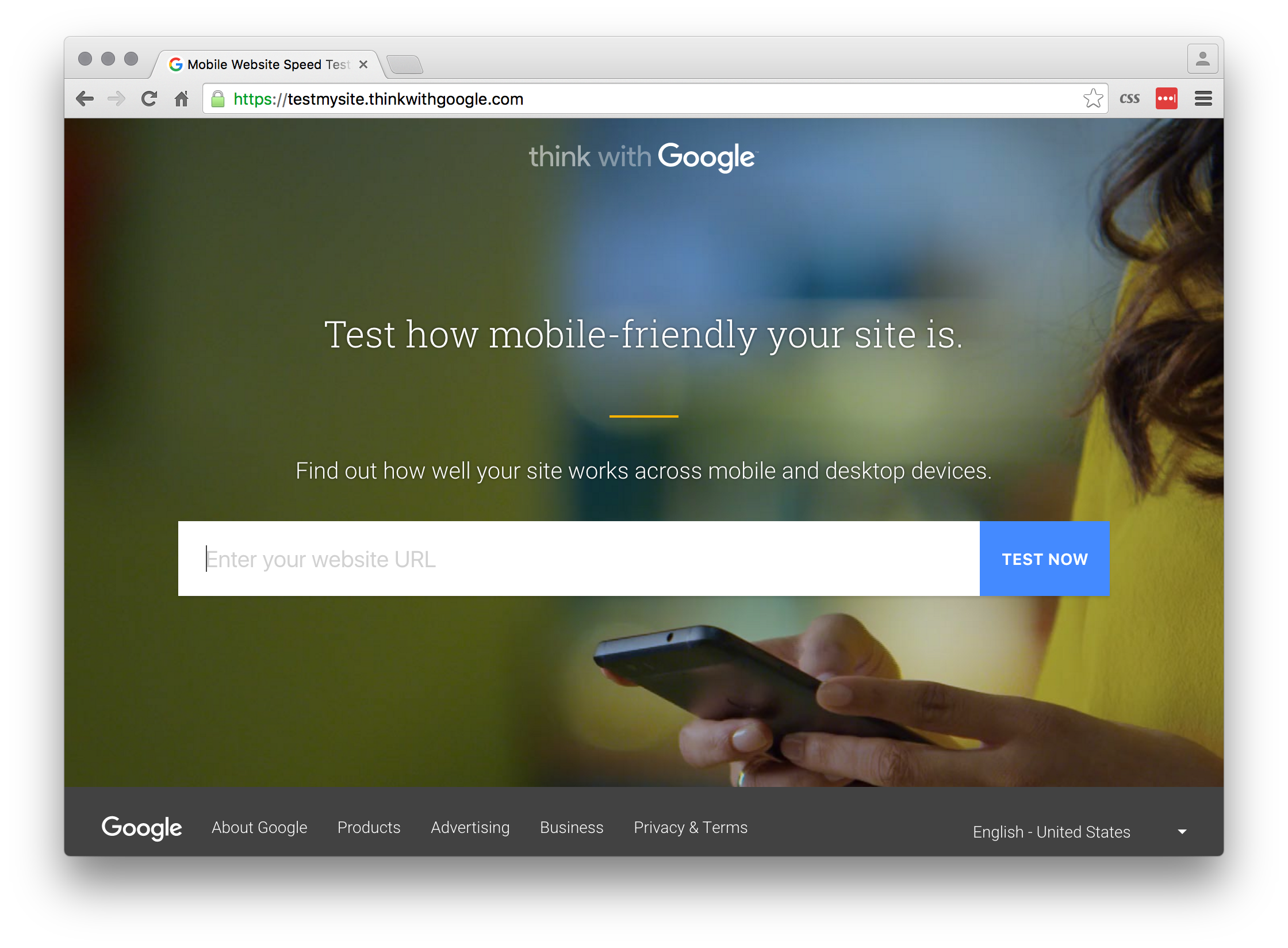
“This week we’ve been testing performance on mobile using this amazing tool created by Google. In addition to your scores you also receive recommendations for improving performance across all devices. I love it because it helps us to avoid spending time trying to figure out what’s wrong in our websites/webapps.”

Lucas


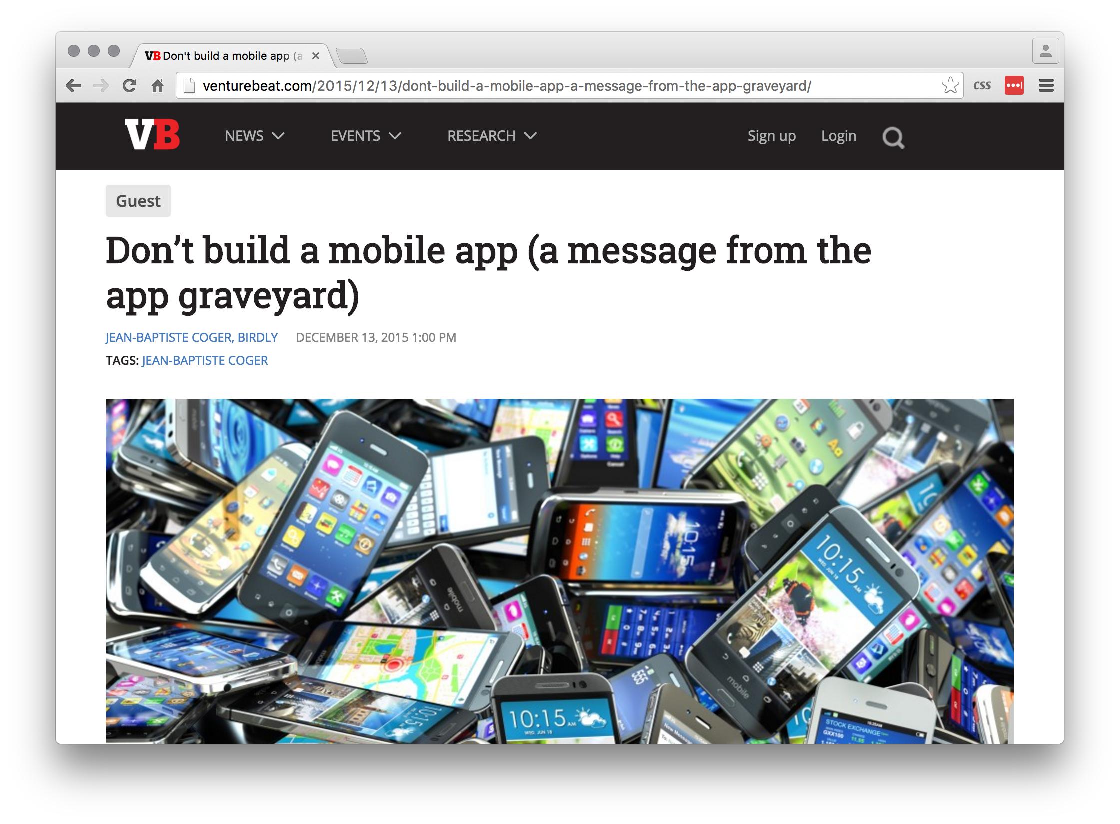
Don’t build a mobile app

dont build a mobile app

“Everybody has an idea for an app but should you invest in it? link highlights some lessons learned by Jean-Baptiste Coger, Chief Product Officer of Paris-based Birdly. A reminder to make sure your target problem is one that your market wants to solve on a mobile.”

Erik


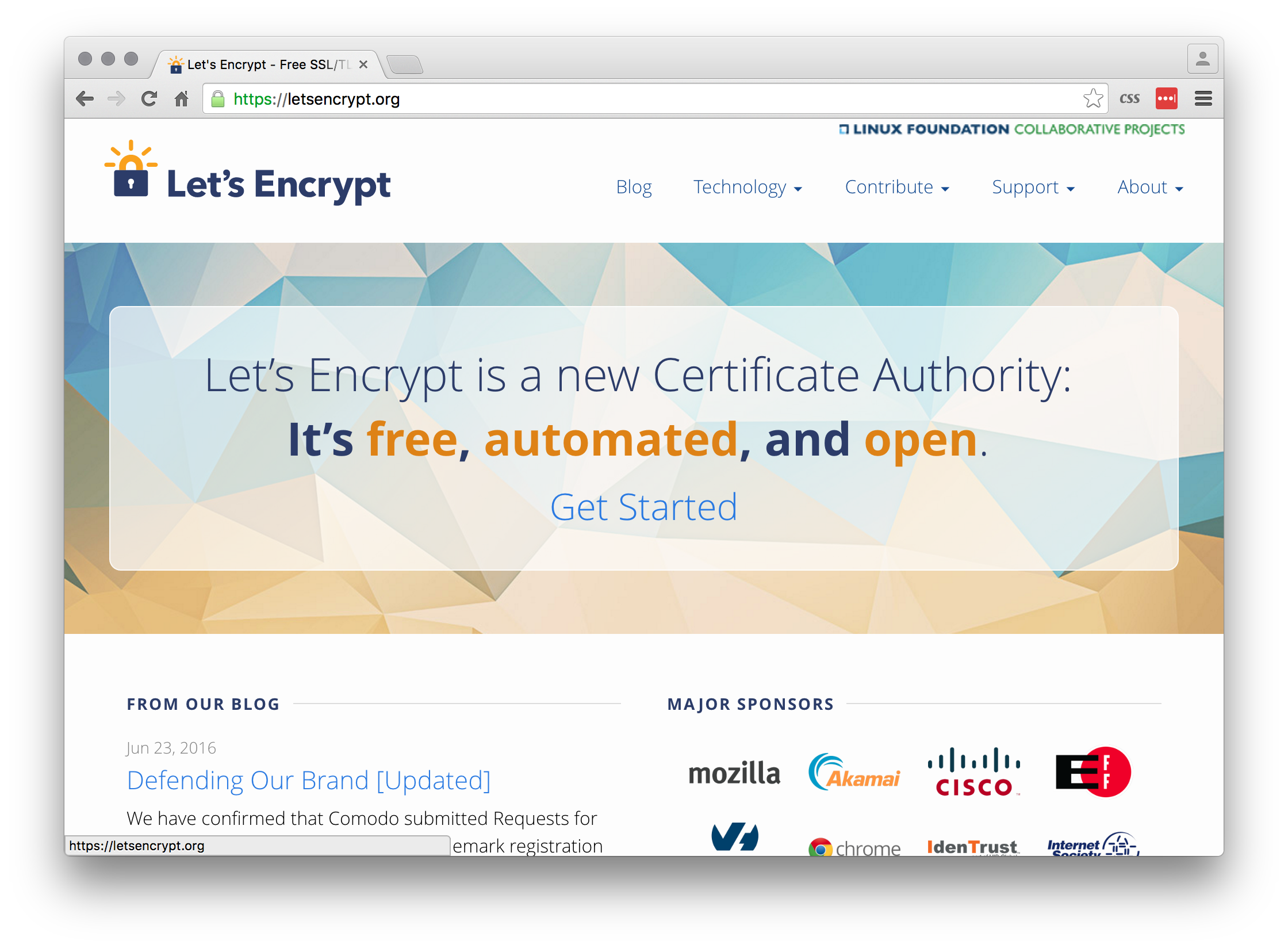
Let’s Encrypt

lets encrypt

“Recently, when the SSL certificates of clients are coming up for expiry (particularly the expensive wildcard SSL certificates) we are using [LetsEncrypt] (https://letsencrypt.org/). This new service allows us to get you unlimited free SSL certificates, it only takes a few hours to setup and will mean you never have to worry about SSL certificates expiring again!”

Matt


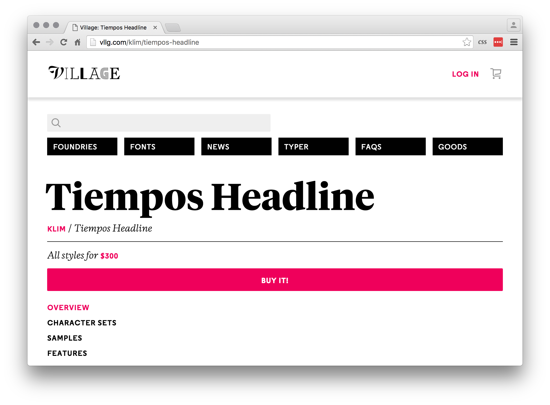
Tiempos Font Family

Tiempos

“Stumbled upon the Tiempos font family and I think it deserves a shout out to anyone who may be interested in using it in their marketing campaign. This font family speaks for itself in terms of personality and boldness. It is important to know that choosing the right font matters. Check out the fonts [here] (http://vllg.com/klim/tiempos-headline), and if you’re interested in using it, please get in touch.”

Felix


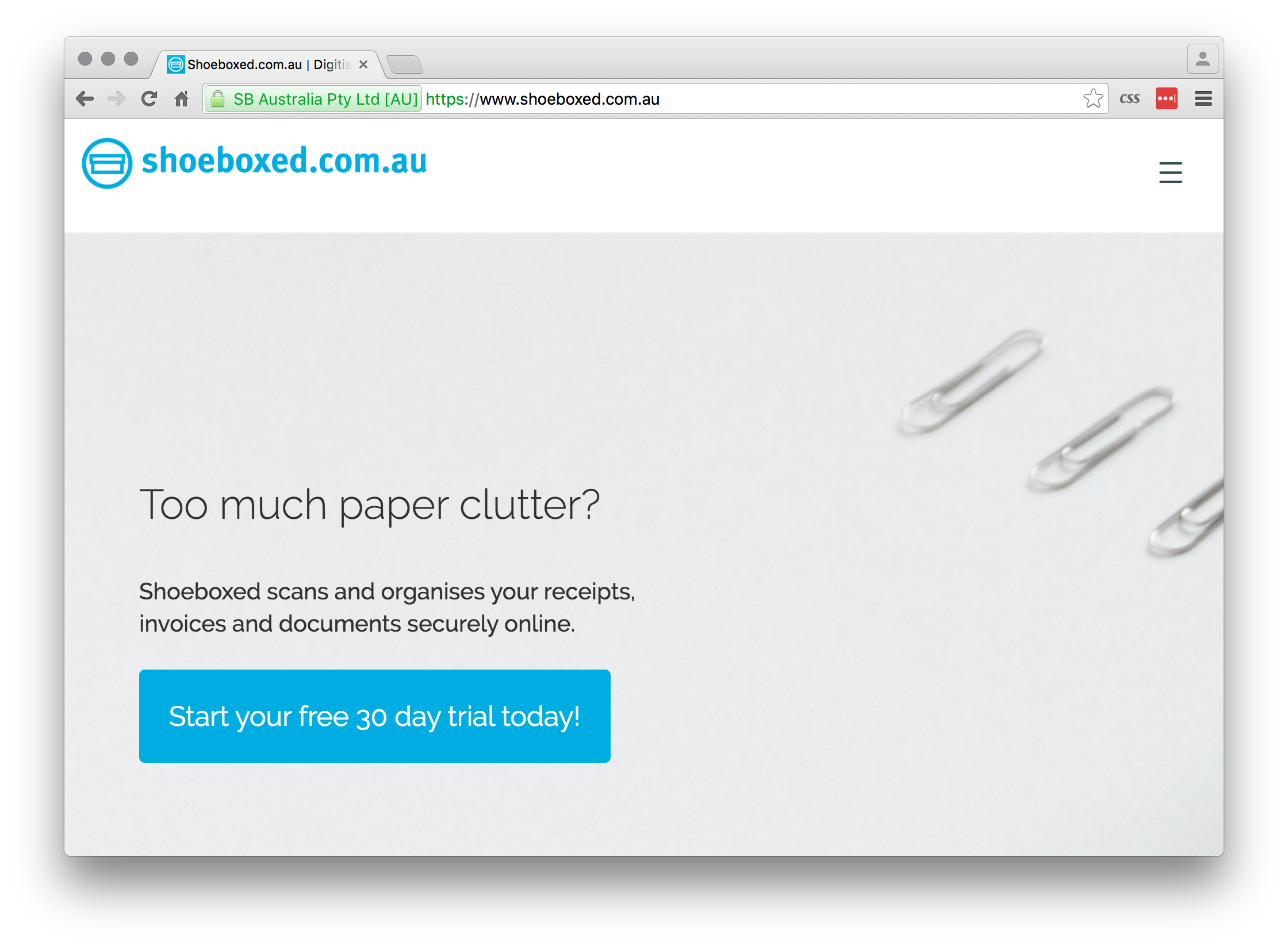
Shoeboxed

Shoeboxed

“We are just days away from the end of the financial year and I was shocked to find out not everyone is aware of Shoeboxed. Able to be used for both businesses and individuals, Shoeboxed takes all your old receipts and invoices, scans them and stores them within your account. Not only does this mean I’m not longer sorting through months of receipts to find that half of them have faded beyond recognition I’m also able to search by vendor, payment date and payment type.”

Madeleine


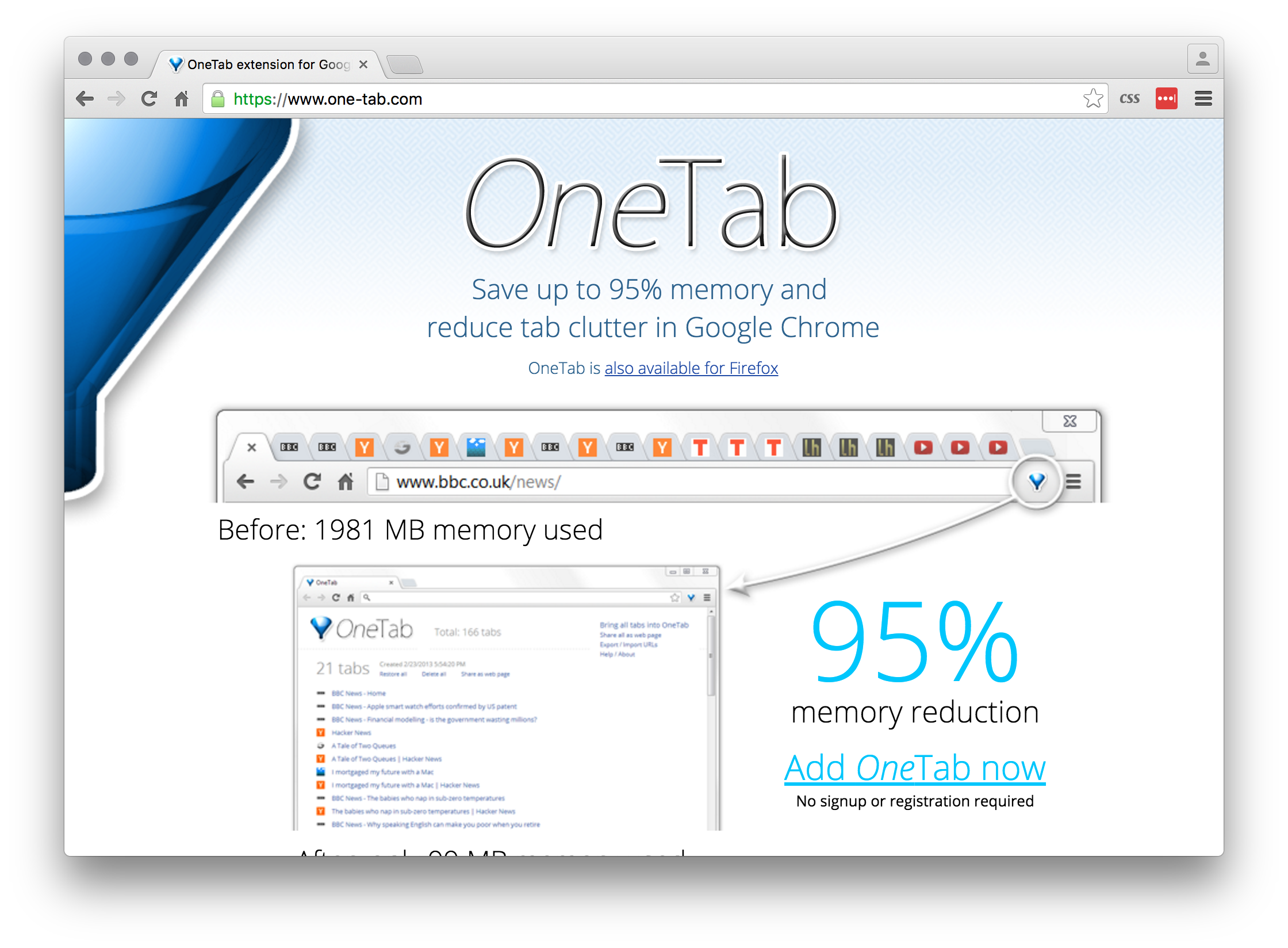
OneTab

One tab

“If you’re like me and end up with hundreds of Chrome/FireFox tabs open, then OneTab can help. It is an extension that converts all your tabs into a list. When I need to access a tab again, I can either restore them individually or all at once.”

Matt


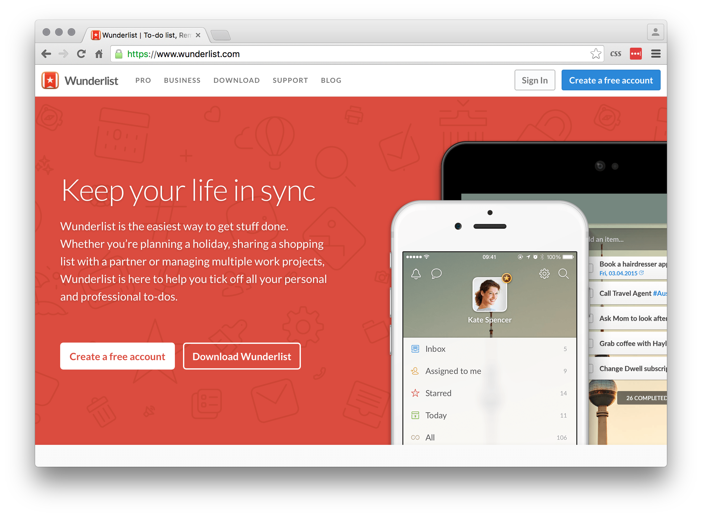
Wunderlist

Wunderlist

“I love a good list, but what I love more is crossing stuff off that list like a boss. I use Wunderlist list to keep track of all the little tasks I need to do in my week for work and home. It works well on both desktop and mobile, and (unlike every other to-do list app I’ve tried) it actually syncs fast.”

Ash


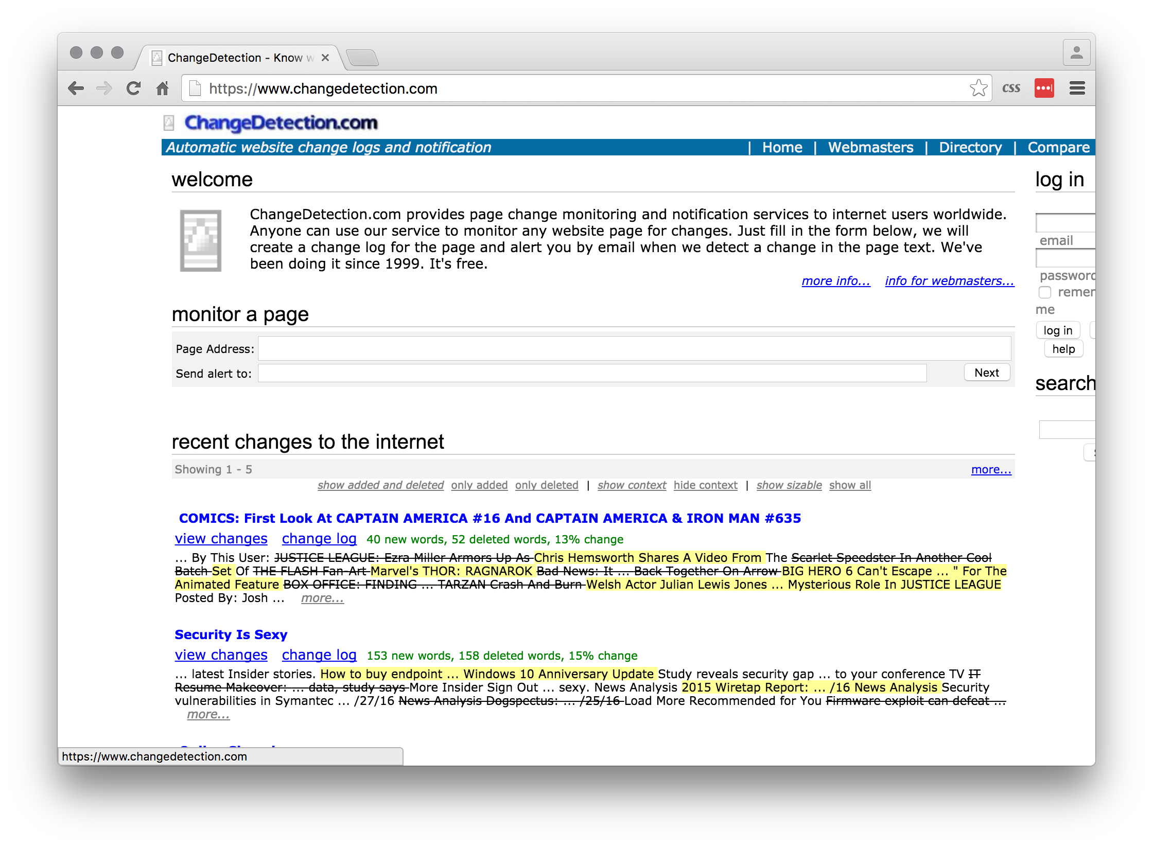
Change Detection

Change detection

“It surprises me how often I want to know if a web page has changed – an event being listed, a price being changed, an article being added etc. Change Detection lets you easily monitor web pages for changes. It will look at the web page everyday and alert you of any changes since the last time it checked.”

Matt


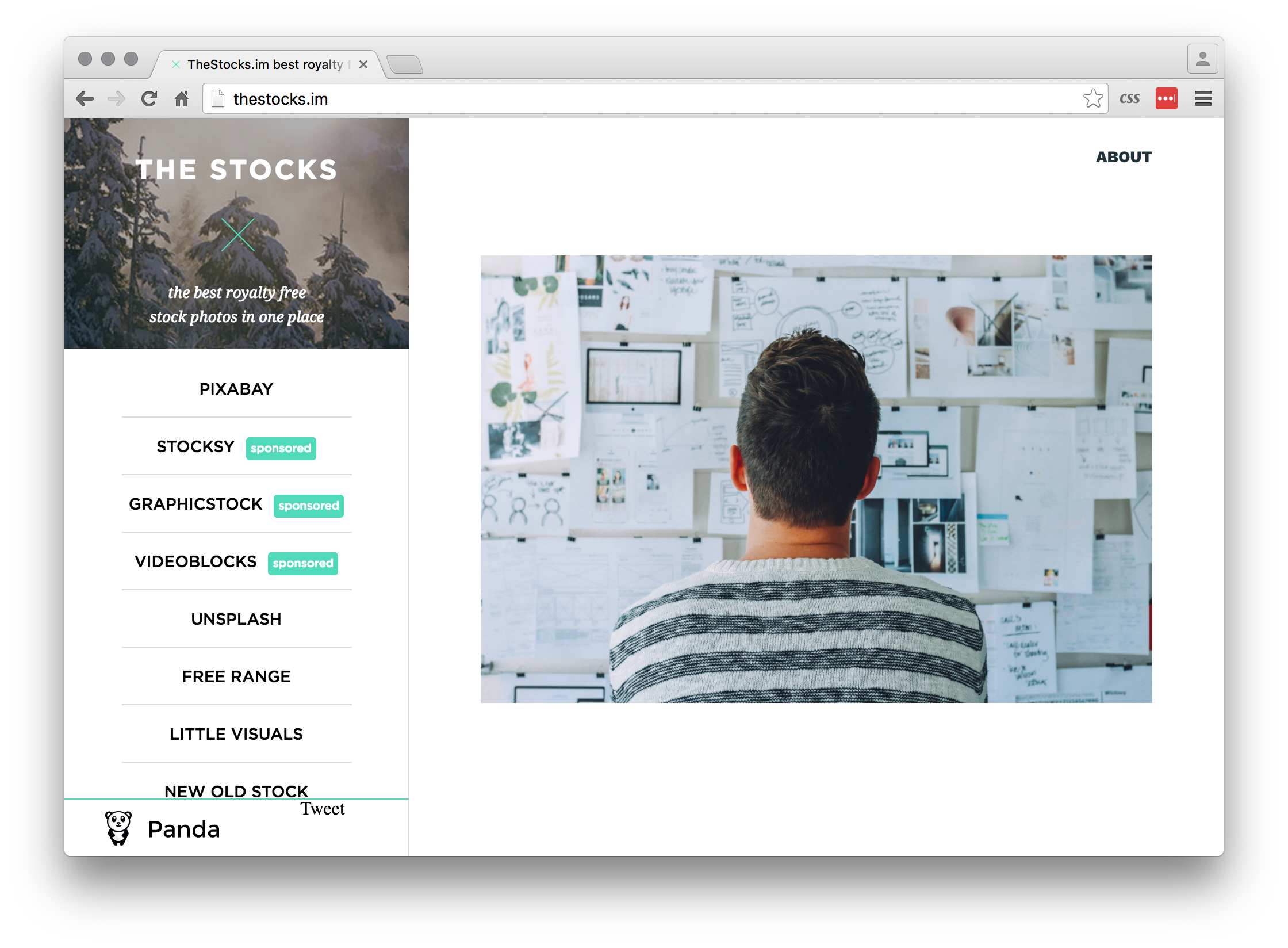
TheStocks

The Stocks

TheStocks collects all the best royalty-free stock photo repositories in one place. Unsplash seems to be everyone’s go-to, Super Famous is my current favourite and notable mention goes to New Old Stock, which offers images with freshly expired copyrights.”

John

What do you get when you throw together an amazing film, the Brisbane design community and a little beer?

You get the Brisbane screening of Design Disruptors and it went down a treat!

After hearing the much hyped documentary from InVision had only Melbourne and Sydney screenings, our very own Felix Lee decided to rally the troops to bring Design Disruptors to Brisbane.

With the help of UQ, we filled the stunning GHD Auditorium and the InVision film did not disappoint. Covering broad strokes of design, user experience, a bit of technical knowledge and a lot of inspiration, InVision told a wonderful story about the relationship between designer and user. They even got a sneaky cameo from Papyrus font in there.

Our fav quotes from the night

“When design is embedded in a business, you arrive at a place where it just feels like oxygen.”


“Design is about every touch point a customer has with your service.”


“Design less and less for yourself and more for other people.”


“Push it until it breaks.”

Emceed by Ashleigh Thompson, the expert panel was made up of Matt Haynes from the Design Conference, Alex Nagavi from Josephmark and Dr Stephen Viller from UQ. The panel was a fantastic wrap to the evening, allowing the panelists to link back to our very own design community in Brisbane and provide insight as to how we can continue to foster the right approach to user centric design.


What Brisbane said about the film


design disruptors crowd

Thank you to our support partners for the evening, and a special thanks to UQ for generously providing such an amazing venue and putting on the incredible spread.


logo lockup


Over the last weekend of November, I had my first hackathon at the brand new NetEngine office for the 2016 Random Hack of Kindness. I was fortunate enough to lead a team of exceptional coders and problem solvers to work on Mentoring, a project inspired by our client Anna from MDA. Meanwhile, I had a lot of fun going through a design process at a rapid pace.

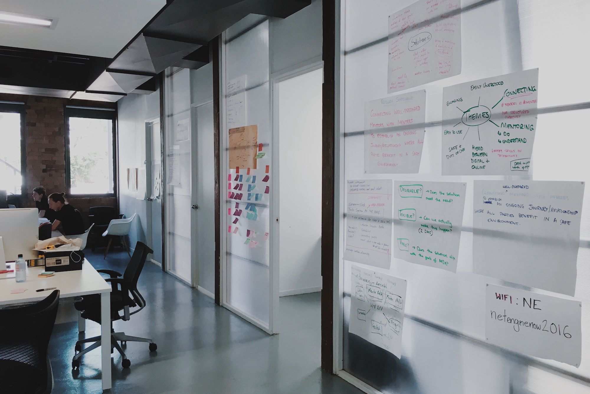
NetEngine New Office

Intro

Client

MDA has initiated a new program, currently named “Human Library”, which matches a young refugee with a well-trained life mentor to help the new arrival with inevitable challenges down the road. Anna, representing MDA in this year’s RHOK, works to help to match and maintain every pair of mentor and mentee.

Challenge

After a group brainstorming, we managed to define the problem using one sentence:

“Connecting well-prepared mentors and mentees to establish an ongoing journey/relationship where all parties benefit in a safe environment”.

Of course, the other greatest challenge was to finish the MVP product with the two-day time restriction.

Idea

Making connections with the local community is always a pain point for any new arrivals entering an entirely different culture. The idea I proposed and later we adopted came about by remembering my fear of going to any social event when I first arrived in Brisbane as an international student. Having a mentor being there for me would have been a perfect way to build my confidence so that I could socialise more and make connections.

Then I realised using an event such as meet ups as an incentive to both mentors and mentees might not only help the mentees to be exposed in a local environment and expand connections but also maintain an ongoing relationship between the pair.

From the client’s pitch, the core of any solutions we might come up with could not escape having a profile system of both mentors and mentees. Therefore, we landed on the rough idea of having a system with the ability for mentors and mentees to go to events together and a profile system as its base.

Plan

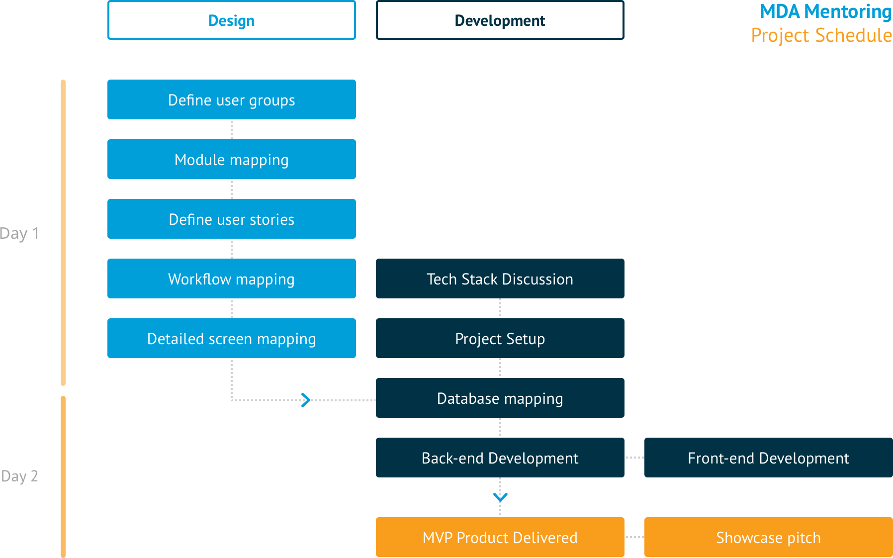
There were a couple of times that the team had to change the plan caused by different reasons, including the unexpected merging of groups due to overlapping of functionalities and disagreement around the technology stack and approach. However, the team managed to pull off a full round of design and development cycle.

Here’s the actual schedule of how we delivered the MVP:

Plan

Design Process

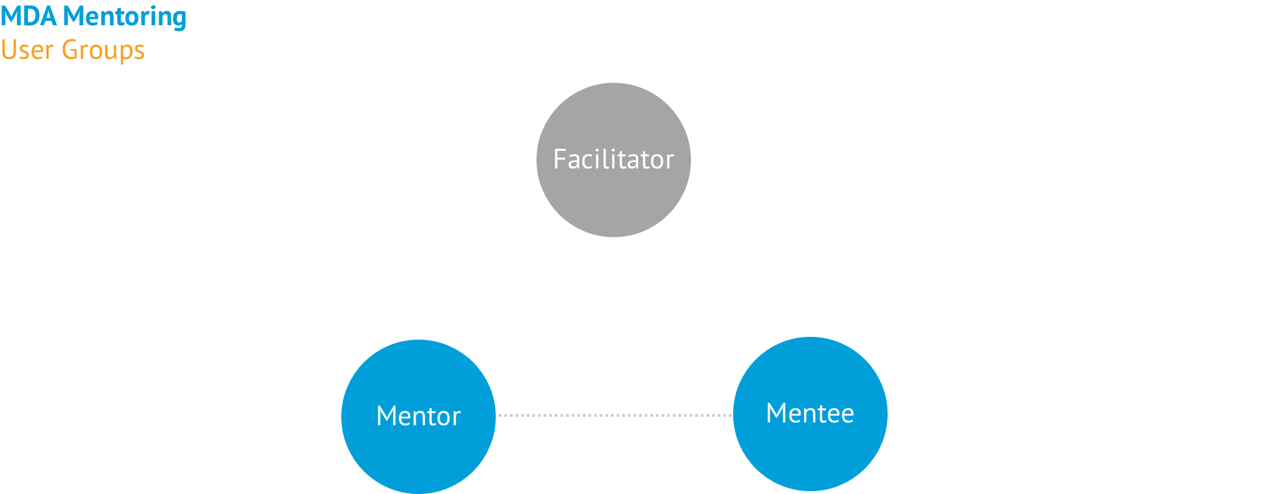
Define user groups

There were initially three user groups, including facilitator (for example, Anna), mentor and mentee. Anna told us it would be appropriate for her to connect the pair and then step away. Therefore, although the monitoring from facilitator is crucial to the program, we decided to take the facilitator out of the equation for MVP after confirming with the client.

Plan

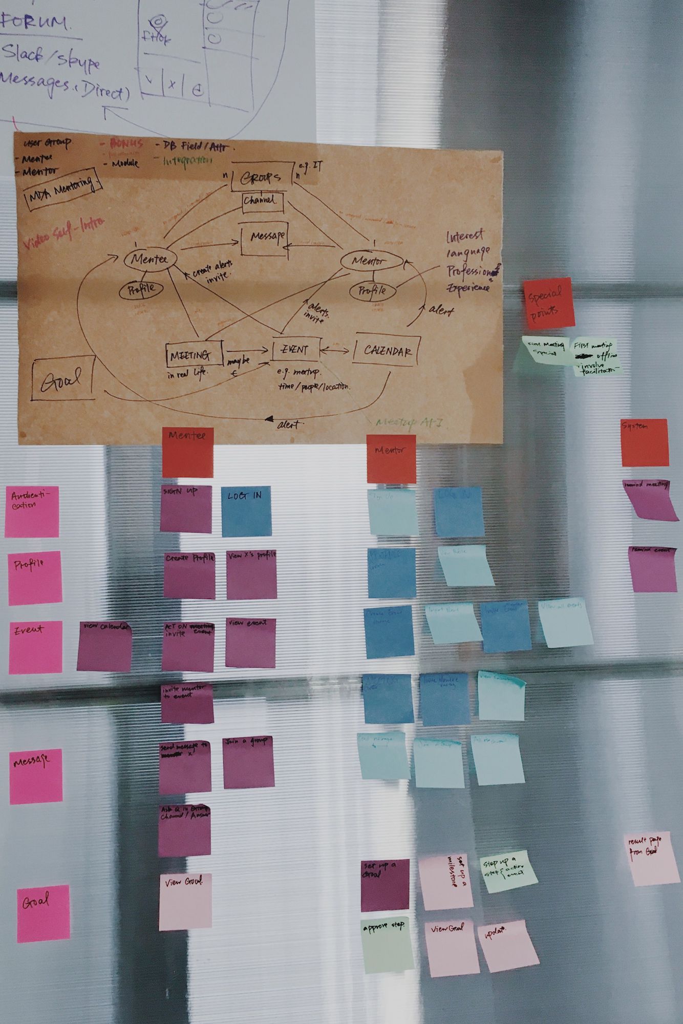
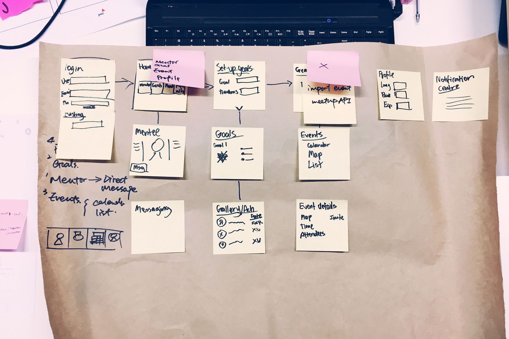
Module mapping and define user stories

Plan

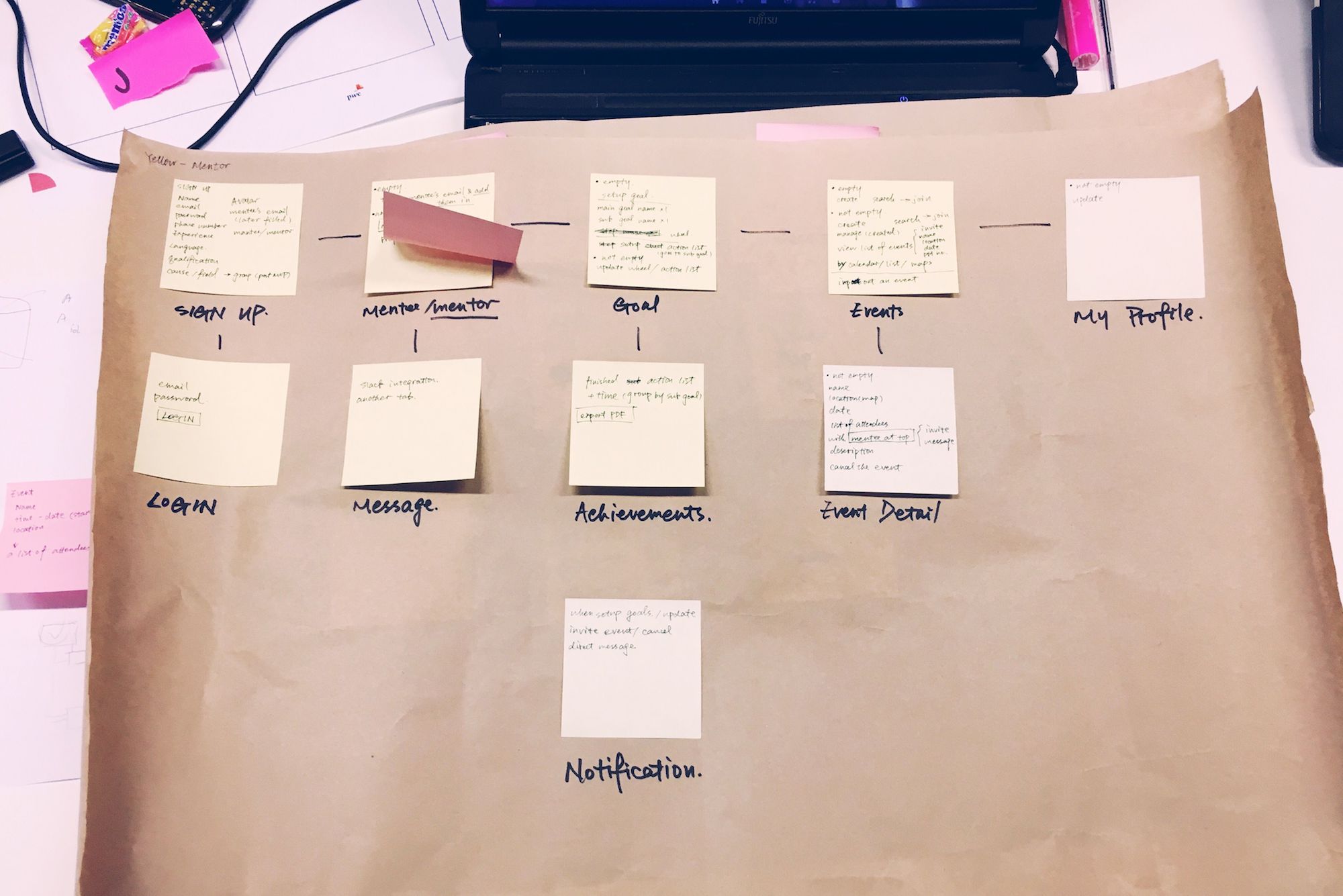
Workflow mapping and detailed screen mapping

Plan
Plan

Tech Stack

Here’s a list of technology we used to create the web application:

  • Python with Django – Back-end and framework
  • HTML, SASS and Javascript – Front-end
  • Github – Repository
  • Firebase and AWS – File Storage and database

Result

The final product was a web application built on Python and Django framework. The decision was made to fit the skill sets of the team and to create a cross-platform product in the quickest way. For the front-end part of the application, I reused some of the stylesheets from a recent personal project with SASS.

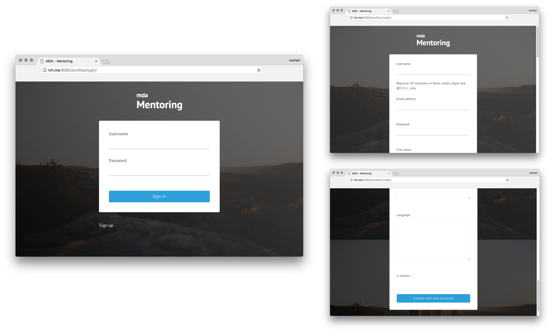
Authentication

A mentor or a mentee can create their profile by signing up. The process will focus on getting the information on either parties' experience, language and contact details. Users can sign into the system after they have successfully signed up.

Plan

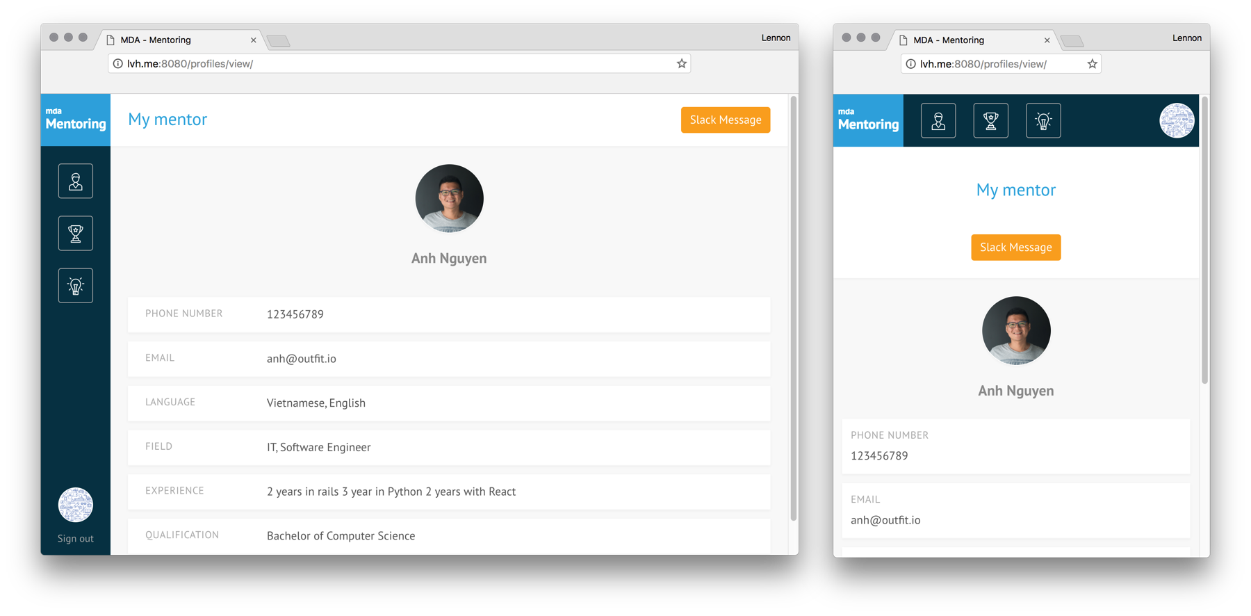
Profile

A mentee will always see his/her mentor's profile (same for the mentor). Users can also click on the "slack message" button and be directed to Slack to communicate with each other. In a future sprint, functionalities such as direct messaging or a group forum could be built within in the system.

Plan

Goal

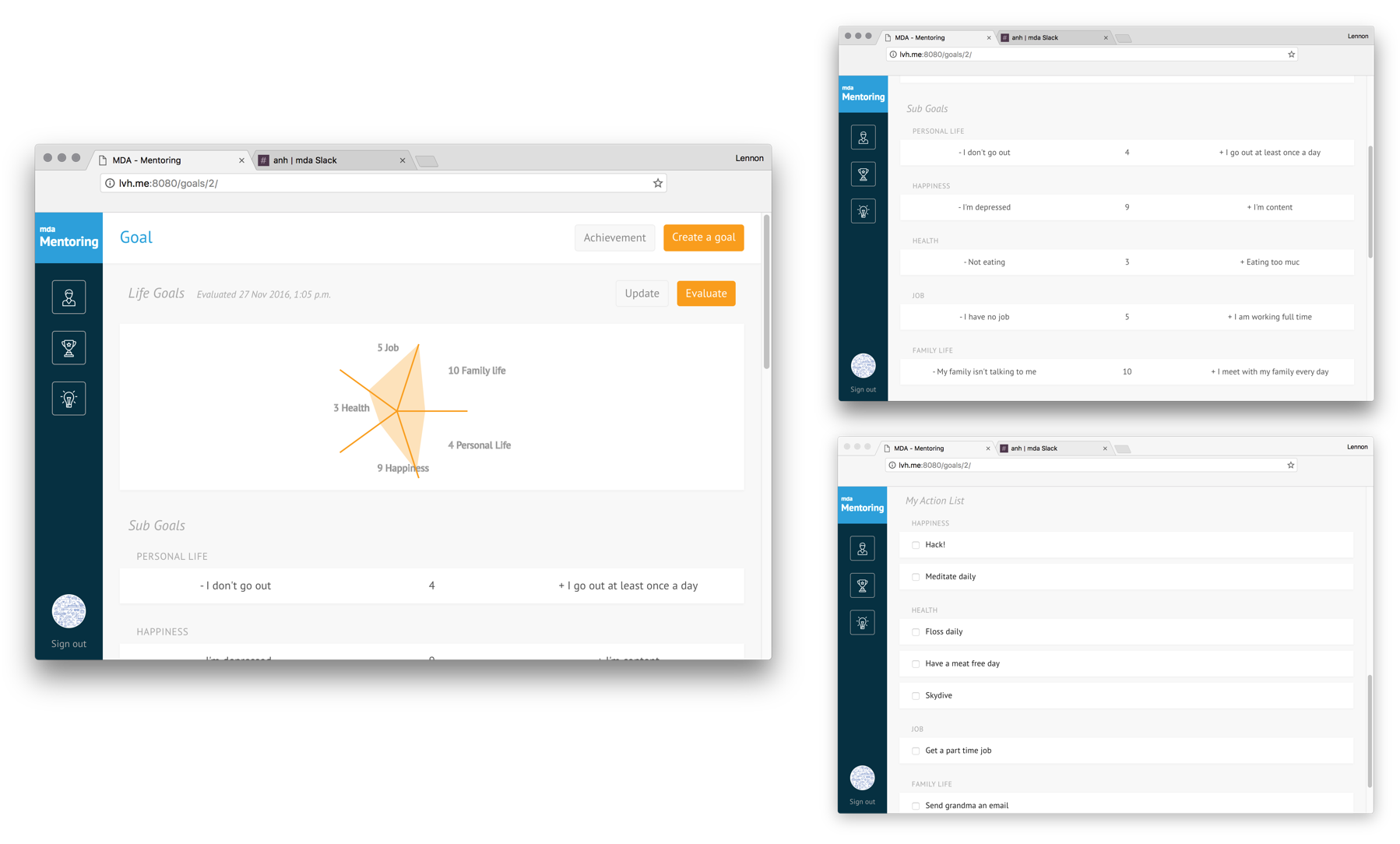
A pair of mentor and mentee can set a series of main goals. For each main goal, users can create several sub-goals with a scale from 0 to 10. From time to time, the mentee can adjust his/her rating as a subjective measurement on how much he/she is heading toward the main goal. The rating will be visualised through a radar graph at the top of the page.

Both the mentor or the mentee can also define some objective goals by creating an action list for each sub-goal. Later, when the mentee has crossed off some actions, he/she can print out a list of achievements through accessing the "achievement" tab. The list is effectively a resume or a proof of experience with the endorsement of the mentor.

Plan

Event

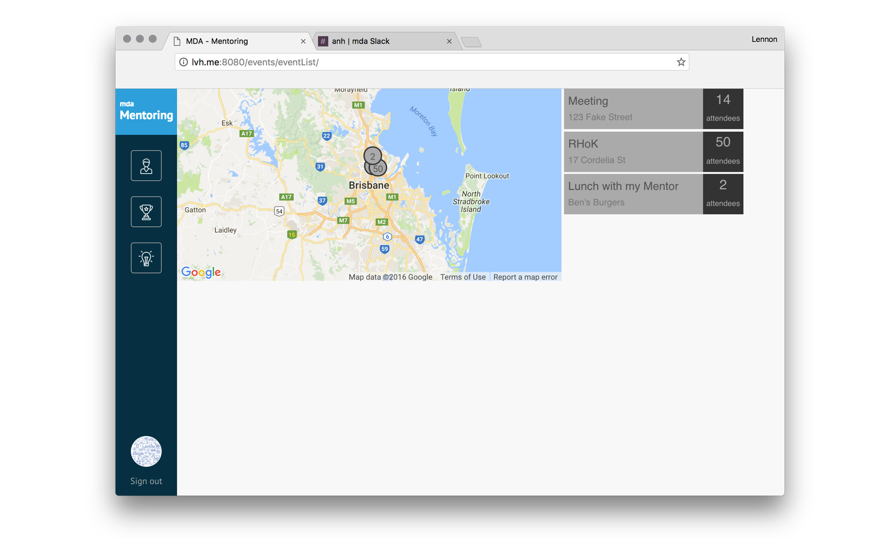
The event module is another crucial part of the application as mentioned earlier in the idea section. Both a mentor and a mentee can create or explore events and invite each other to attend. An event can be a one-to-one meeting between the pair or a meetup event to expand the mentee's connection.

For a particular event, a user can view the number of participants, whether his/her mentor or mentee is going, location and date information.

Plan

Other

There were a lot of functionalities we planned to cover during the event, including:

  • scheduling and calendar for event
  • ability for mentors and mentees to join multiple groups based on their interest
  • notification and alert
  • and more

We won!

The team won the first place in the hackathon. However, Anna’s excitement when listening to our final pitch meant much more than winning.

Reflection

  • Don’t be afraid to disagree with others. Be confident about what you do but also be respectful to others.
  • Have a plan.
  • Follow the design process even if the time is pressing. We need to know what we are building before actually start doing it.
  • Jump out of my comfort zone. I realised that I was getting too used to working in a Ruby and Rails environment with HAML and SASS by my side. It took me a while to adjust myself to the original HTML markup syntax.
  • It is wise to reuse parts of some previous projects if necessary to reduce the time for an event like this. I borrowed the basic layout from a personal project. It saved me tonnes of time as I had thought through the user experience of the interface and resolved the responsiveness in the code.
  • Further on the previous point, be aware of you and your client’s IP.
  • Prioritise the tasks, finish what is essential first and then polish.
  • Make sure everyone has fun.

End

With the ever growing number of tech companies in Brisbane it wasn't surprising when we moved in to our new Cordelia St offices in South Brisbane and our upstairs neighbours, Digital 8, were working within the same industry.

While we specialise in software design, Digital8's forte is web design and digital marketing. Recently we teamed up for the UI/UX design piece for one of their clients. Along with Tim (Digital8’s project manager/graphic designer) we scoped, wireframed and designed the user interface of a brand new suite of websites for a national client of Digital8’s.

Project Brief:
We were initially contacted by Digital8’s General Manager Joe McCord to work on the front end of a website for one of Digital8’s overflow clients. The brief was simple: work in conjunction with Tim to respond to the clients spec by creating a scope, building a wireframe for the front end and assisting with UI and UX.

What We Did:
Most obviously we began the process with conversations and a brainstorm about the project, we broke down the spec and designed a wireframe that was put forward to the client and approved immediately. We then worked with the guidance of Tim and Joe to review the wireframe, then built out to create a more detailed mockup that would give both the client and the developers a broader understanding of the direction of the project. Again the clients were happy and our part in the project was delivered.

The Outcome:
The part of the project that we worked on was a success both from a technical and professional viewpoint. Working collaboratively with our neighbours was a great way to get to know their specialisations up close – allowing us to keep an eye out for more opportunities to work together in the future!

“The cost of hiring someone bad is so much greater than missing out on someone good – Joe Kraus”.

Today apps come from every industry: media companies, banks, airlines, recruitment, cafes and restaurants, government agencies, games, and social networks, just to name a few. Everyone has seen headlines of inspiring multi-billion dollar apps from Instagram to Uber. Naturally, this has forced brands to get into the mobile and web app space to grow and connect with their customers.

What type of app?

Most apps fall into one of the following three categories.

Mobile app Web app Cross Platform
A mobile app is a software application developed specifically for use on small, wireless computing devices, such as smartphones and tablets, rather than desktop or laptop computers.

Usually available through distribution platforms called app stores, such as the Apple App Store and Google Play store.

They’re designed with consideration for the demands and constraints of the devices, and also to take advantage of any specialised capabilities they have. A gaming app, for example, might take advantage of the iPhone’s accelerometer.

A Web application, or web app, is an application program that is stored on a remote server and delivered over the Internet through a browser, such as Chrome, Safari, or Internet Explorer.

Web applications are usually coded in browser-supported languages, such as JavaScript and HTML, as these languages rely on the browser to render the program executable.

The web application requires a web server to manage requests from the client, an application server to perform the tasks requested, and often a database to store the information.

Cross-platform apps run on multiple computing platforms such as iOS and Android, along with modern web browsers.

You can download a cross-platform app on an app store and run on a web browser. Facebook is a great example of a cross-platform app. You can download it on your phone or access by going to facebook.com in a web browser.

The main benefit of cross-platform apps, is that you don’t have to develop a separate app for each platform. You can have one app that’s compatible with your chosen platforms.

Cost structure

Most apps go through a design phase and a development phase before they’re launched.

In the design phase, the client will be working closely with a designer to come up with the look and feel of the application. During this period, you’ll also want to identify and design core feature workflows, so any issues are found. The goal of this phase is to have a blueprint of what the developers are going to build. This phase generally takes 1 to 2 weeks depending on the size of the application.

The development phase is where the developers build the app based on the client’s requirements and designs made in phase 1. All frontend and backend code will be written and deployed on a server for the client to test and offer feedback. During this whole process, rigorous testing will be done by the development team to ensure your app is stable.

Phase 1: Design phase Phase 2: Development phase
Design meetings
UX/UI
Mockups
Copywriting
Feedback
Project managment
Development meetings
Frontend development
Backend development
Servers
Feedback
Testing
Project management

Types of functionality

Most apps that NetEngine has built generally fall into the following three categories and price ranges.

Simple Apps Database Apps Full Featured App
A simple app consists of only 1-4 pages. Like a Todo app. They have only one core feature and don’t require a lot of expertise to build. Your app needs to store information on a server or on the user’s device, such as a username, password, first name, last name, and address. This makes the architecture more complex.

If your app needs a custom design, and users should be able to log in, then your app falls into this category.

You want your users to access information in your app on any device or web-browser.

The app has a custom design with many key features and users can login and view information.

$20,000 – $40,000 $40,000 – $100,000 $100,000+
Up to 4 Weeks 1 – 3 months 3+ months

Cost of features

After launch it’s recommended you talk to as many users as possible, so you can receive feedback on what to improve or build next. Successful apps never stop development. They’re always changing and improving to offer more features and value for users. Below is a breakdown of common feature requests.


Email login Social login Post content
Users sign up with basic information and log in with an email and password. Users can login with Facebook or Google and sync basic information. Users can post content like a blog post or product for other users to see.
$2000 – $3000 $3000 – $4000 $5000 – $10,000


File uploads User profiles Geolocation
Users can upload files, such as an image and have other users view it. Users can update their profiles and view other user profiles. Users can view their current position on a map.
$2000 – $4000 $3000 – $5000 $5,000 – $7,000


Payment system Single sign on Calendar system
Users can pay for a product or service using a credit card or PayPal. Users can sign into a single app and are then signed into other apps, like Google. When you sign into Gmail, you’re also signed into Google Calendar. App has a calendar system where events can be scheduled, similar to Google Calendar.
$5000 – $7000 $7000 – $10,000 $15,000+
  • Prices on this page are estimates and examples. The total cost will take into account the developer, how it’s implemented into your app, among other things.

We would love to hear about your idea!

Now that you have a rough idea about how much your app might cost the next step is attened a NetEngine Concept Workshop.

It’s the only way to validate your project’s assumptions and start moving forward with your project. 95% of our clients said they would recommend it!

Apply for NetEngines Concept Workshop

When handling state changes or object and logic condition changes, one of the most useful gems is aasm. However, after many years I find that it’s often under-utilised and even misused.

It’s really easy to grab the aasm gem and begin implementing the ActiveRecord methodology. This implementation is effective if the state and its dependencies are only models and providing you are not creating circular dependencies.

To get your head in the game here’s a quick example we came across that required us to implement something new:

  • We have a booking for a room when the user first begins the booking process we give the booking the state: draft.
  • As the user progresses, the date is confirmed and the state is changed to pre-reserved.
  • Once the payment has been received the state should be changed to booked.
  • Finally, when the booking has been finalised, the status will be fulfilled.

Of course, we might have more transitions between those cases, but for this scenario, four will suffice.

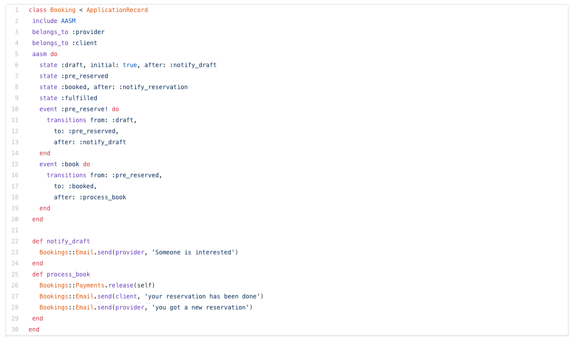
If we go with the normal Active Record style, our code might look something like this:

Even when the previous approach is quick and simpler. There are a few cons:

  • Booking model is prone to becoming a ‘god object’.
  • Single responsibility principle is being contrevend. After changing states we are adding business logic. Booking is responsible for persistency, changing states (we can consider this as persistency if we don’t want to be strict), sending emails, and releasing payments.
  • Testing will become harder, with more items to stub.
  • Additionally, the dependency direction is wrong, entities now be aware of other services.

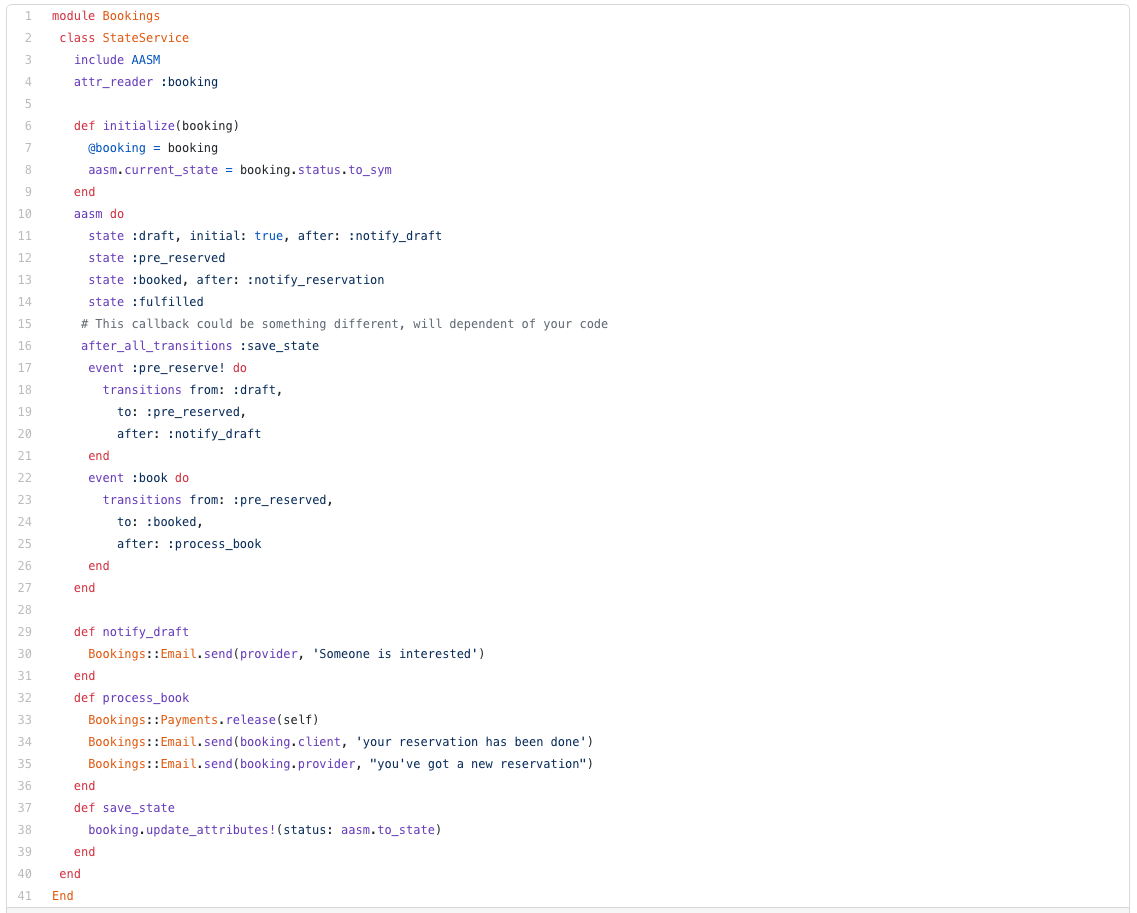
A simpler approach would be using the state machine as a service, like this:

To achieve this implementation we only need to be aware of 2 sections. Everything else is your own code:

And we need to make our changes persistent:

Considering this approach we will get two huge benefits:

  • Booking model is only responsible for data persistency
  • This StateService is our actual State machine and the dependency direction is now as it should be. The service no longer requires an understanding of other services and the booking model won’t have awareness of emails or payments.