Smart Clinics, a network of family medical centres entrusted NetEngine to improve the conversion rate of their online booking form to make GP appointments a more positive experience.
The NetEngine team looked deeply into the existing product and conducted a 7-day user experience study.
Day 1: Understand the product
a. Process mapping
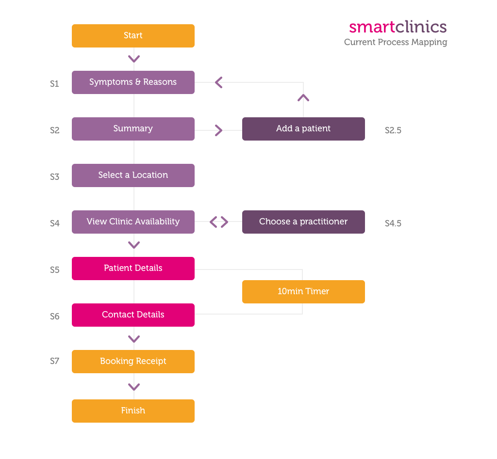
The online booking form developed by Smart Clinics is to help users easily book a GP (General Practitioner) appointment at a nearby clinic, using a laptop or mobile phone. We walked through the process a couple times to map out the logic of the form.
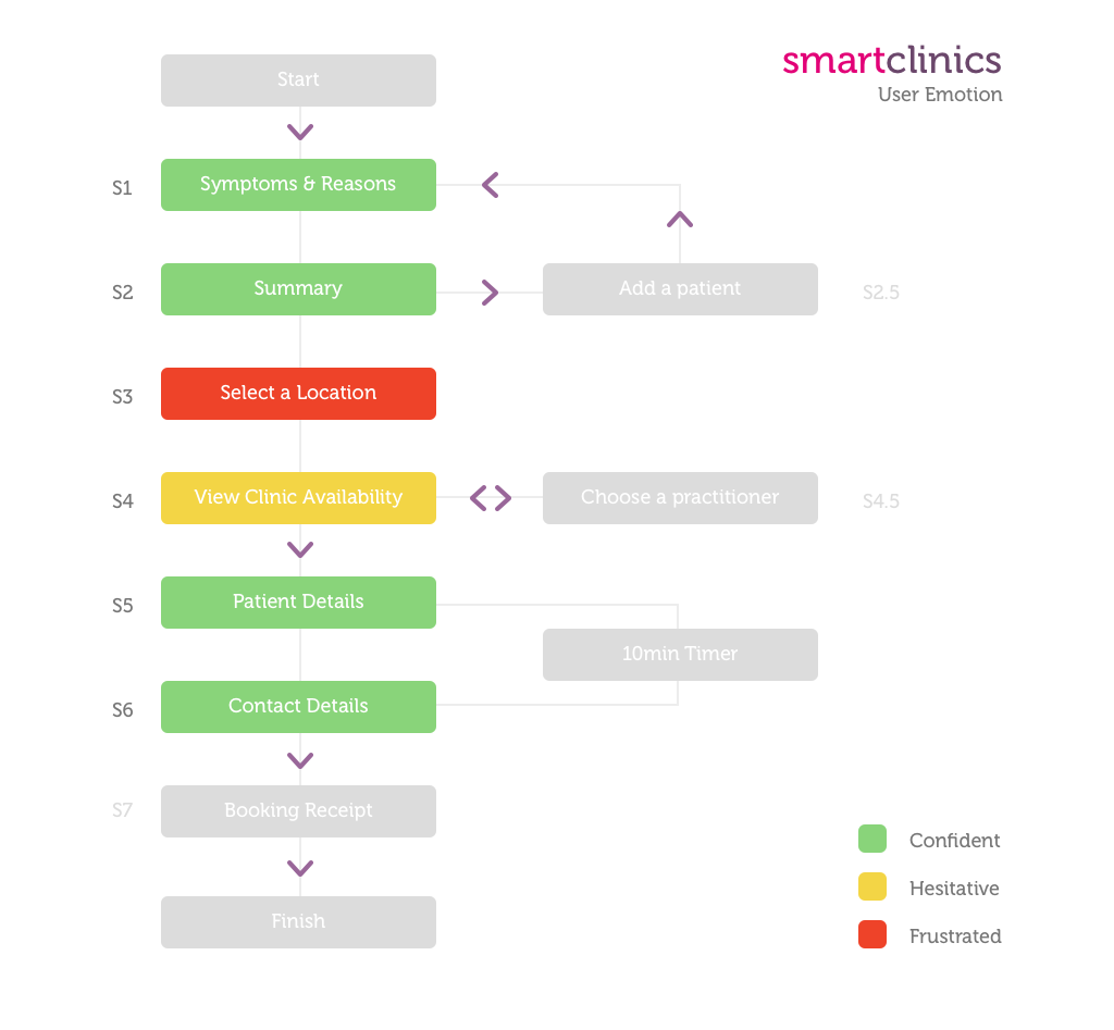
The whole process includes 7 different steps (S1 to S7), along with 2 intermediate steps.
b. Create a list
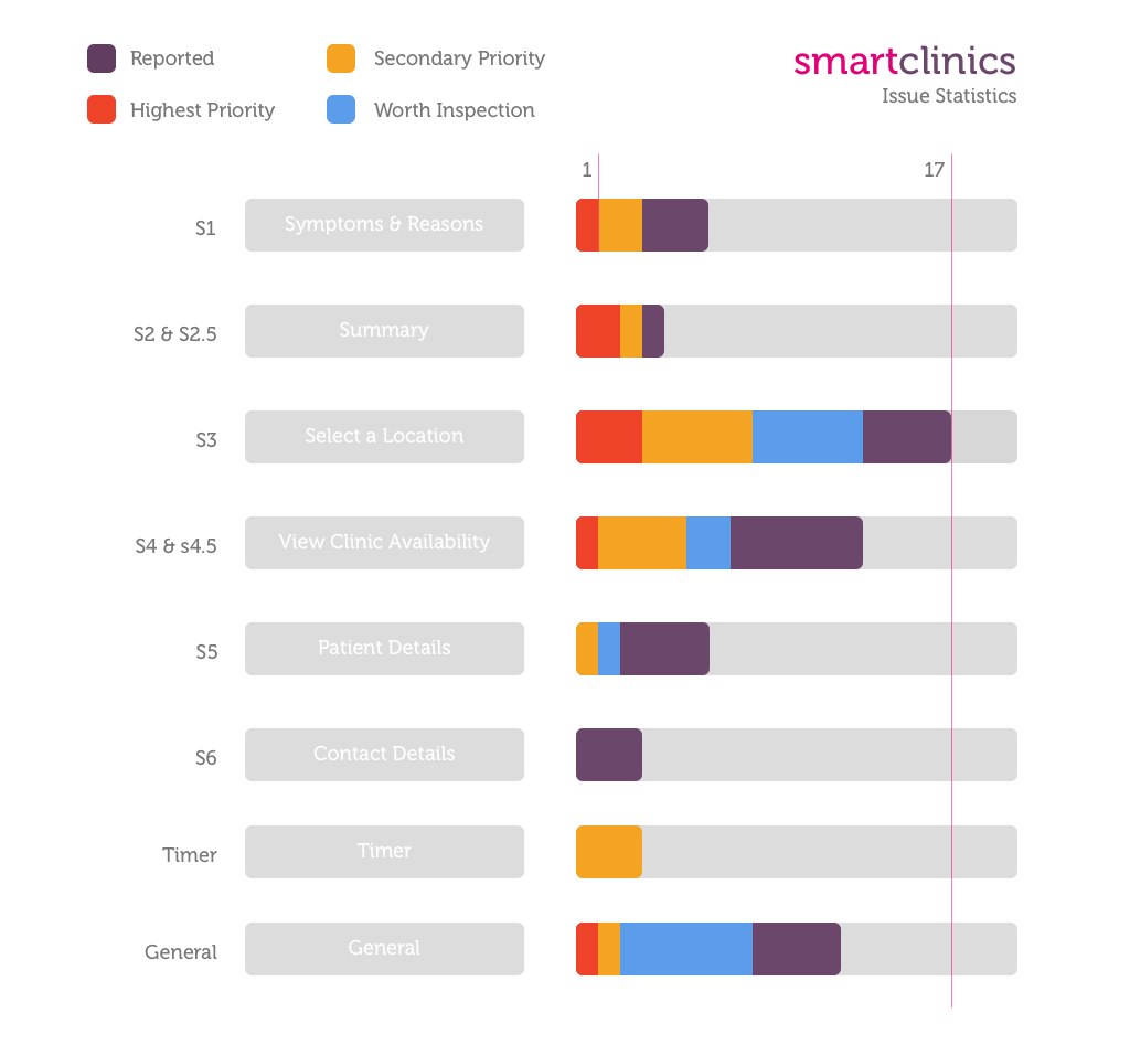
The team then created a list of problems, issues and suggestions based on our understanding of the product. Client was approached to help the team clear the questions and doubts.
c. Ideal process mapping
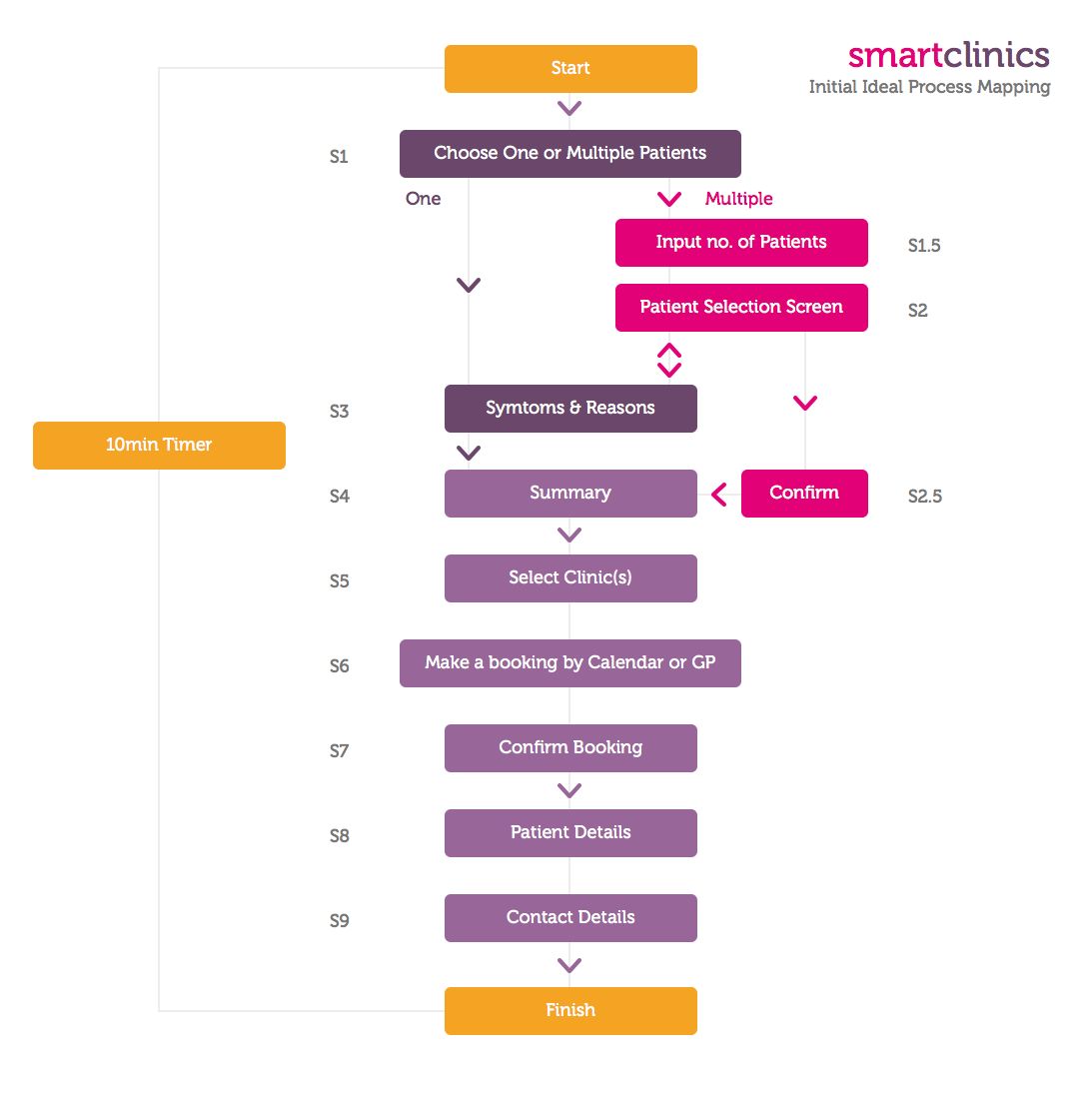
The NetEngine team pitched a recommendation of an ideal process.

Day 2: Usability testing
a. Design
Before inviting the users to our office, the team carefully designed a usability testing session. Here’s a sneak peek at the design:
- Filling out a personal information and a privacy consent form
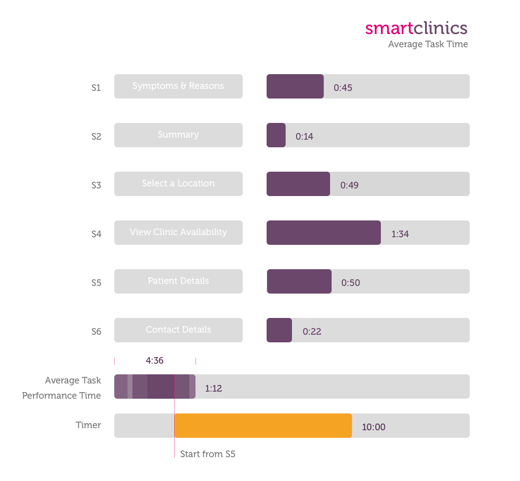
- 1st round: Participants were asked to picture themselves as a patient and go ahead and use the form to book an appointment fitting their needs; time spent and emotion expressed for each step will be recorded
- 2nd round: Participants were asked to perform some more specific tasks under instructions
- Participants were asked to provide more feedback and suggestions in addition to the
previous two rounds of testing
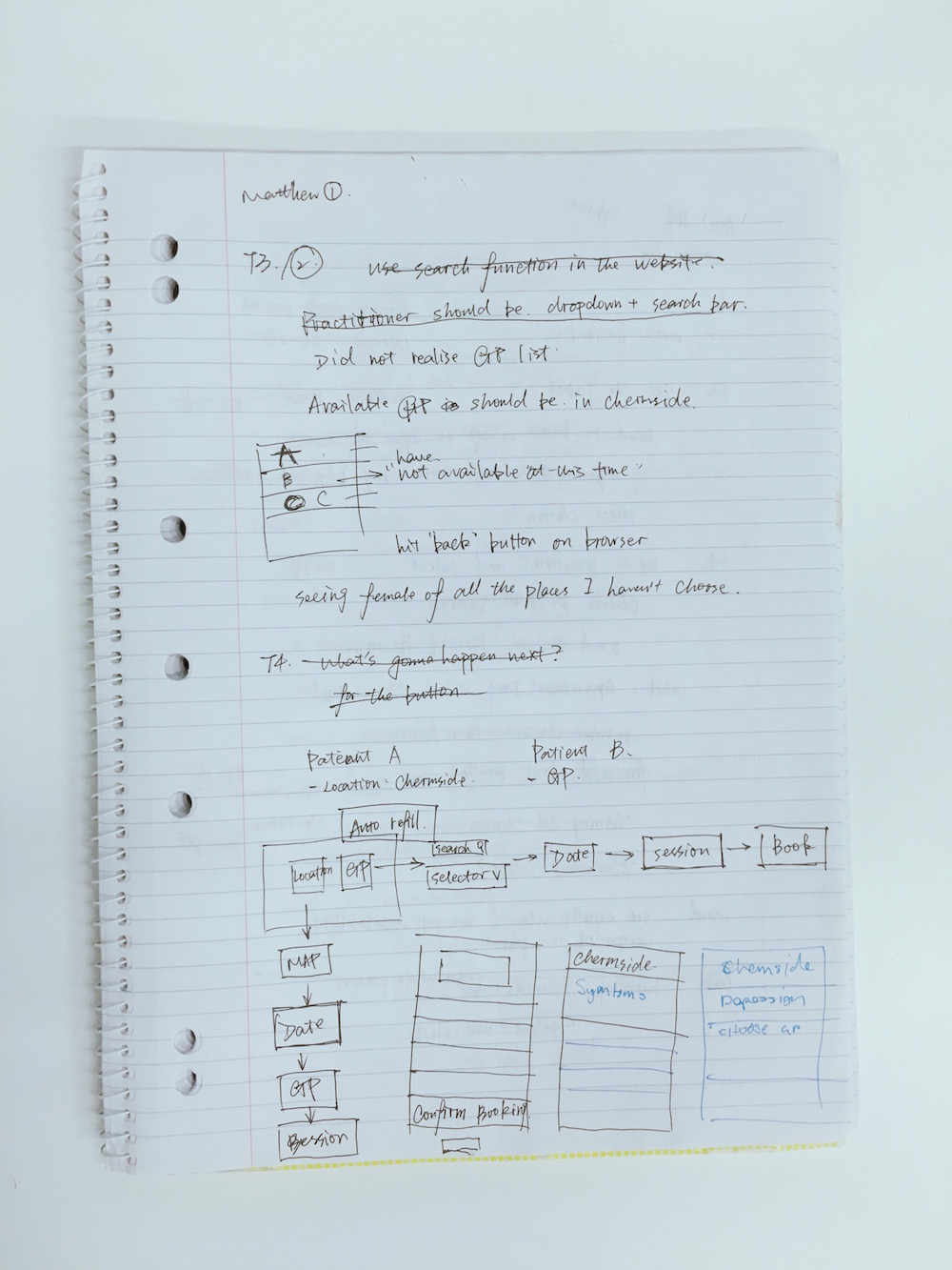
b. Testing session
Here are some interesting statistics:
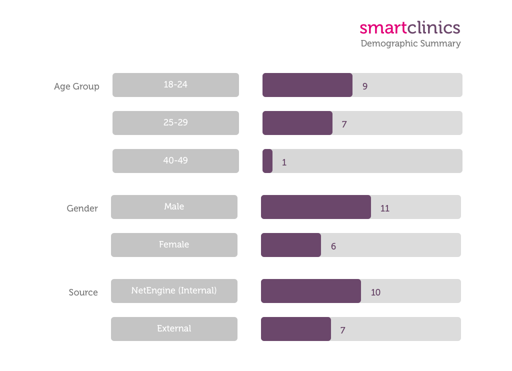
- NetEngine invited 17 participants for testing
- A full day was dedicated to the testing
- NetEngine took over 26 double-sided A4 pages of notes
- Over 70% of the participants book a GP consultation over the phone
- Only 2 out of the 17 participants make bookings either through an app on the mobile phone or desktop
Day 3: Find the problem
a. Aggregate and visualise
Statistics NetEngine collected over the course of the project:
b. Key findings
- The online booking form is generally easy to use
- Initial target was mobile users
- All of the participants stated that they were never asked about symptoms and reasons
when making a booking over the phone or using other online platforms
- 76% of the participants believe it’s unnecessary to have the functionality of multiple-
patient booking options
- Confirmation is essential during and after making a booking
- Patients have different priorities when making a booking with a GP
Day 4 – day 7: Redesign
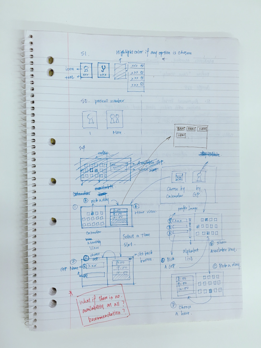
a. Tackle the problem
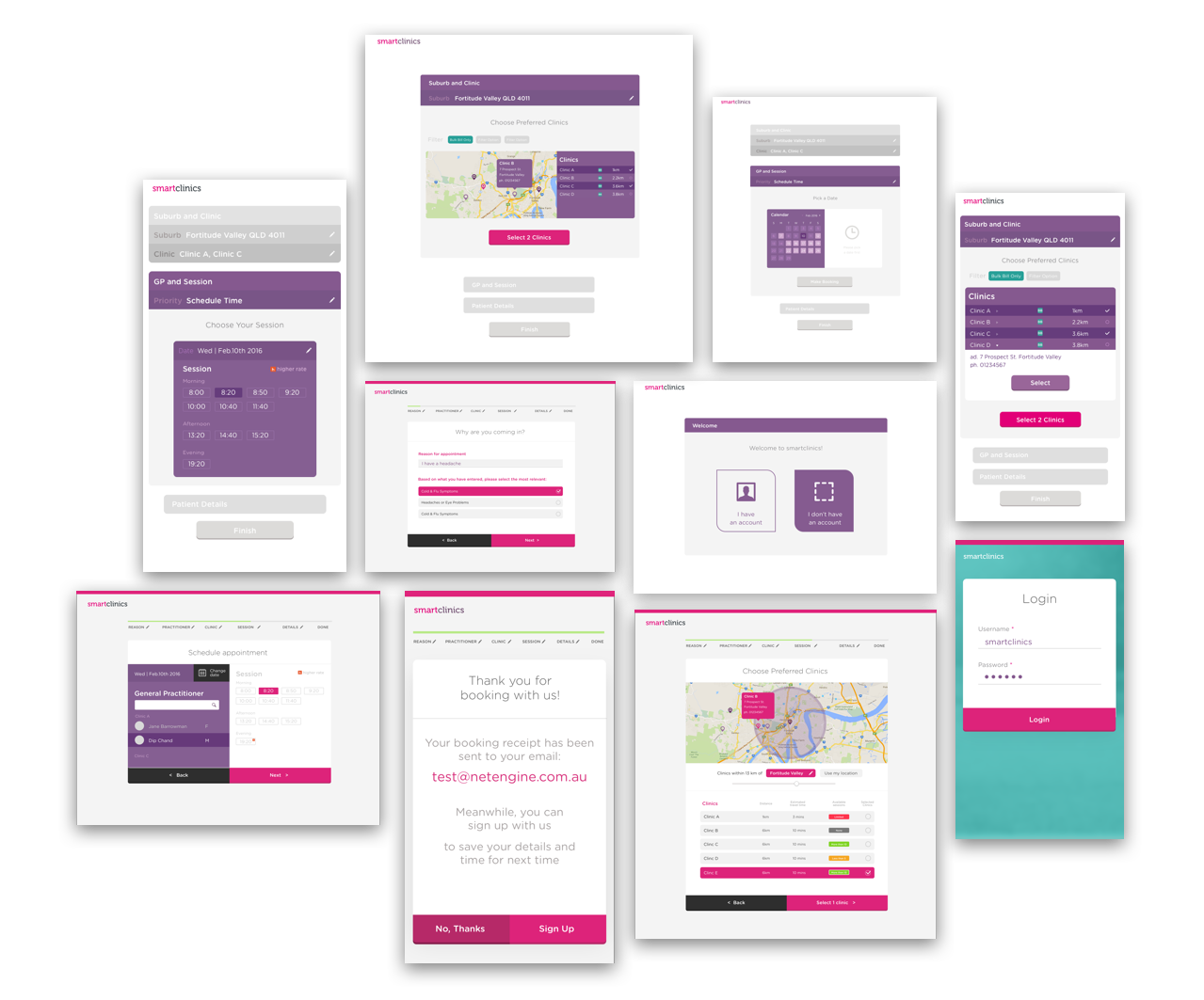
NetEngine introduced the following concepts and features to the wireframes and new design:
- List approach: the re-design used a list approach to constantly remind users of what they have chosen and allows them to go back to any previous stages to make changes should they wish to.
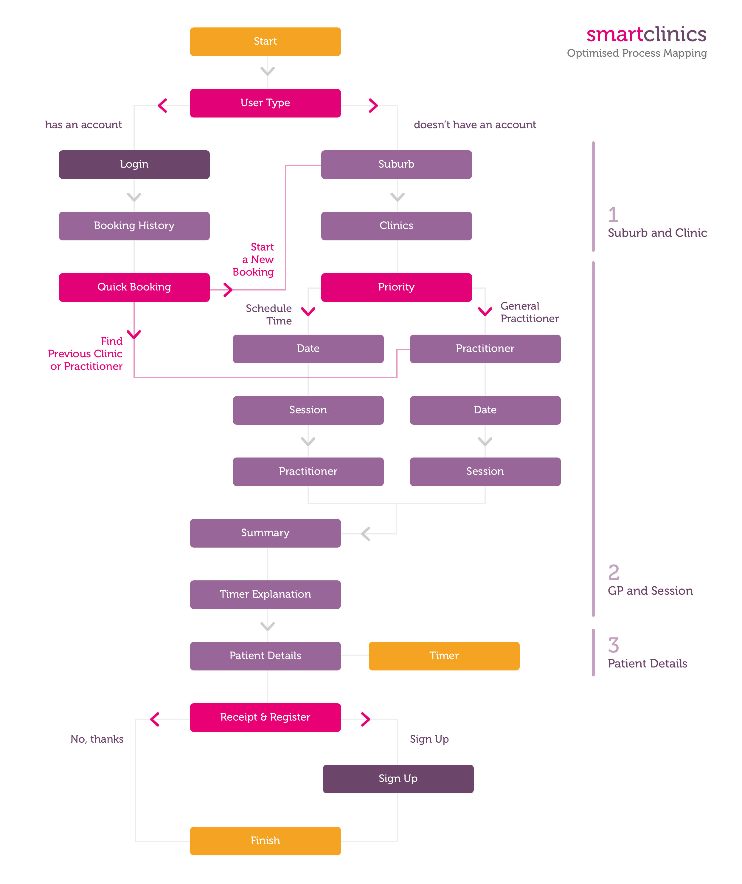
- User type and user system: user will be asked to choose whether they already already a registered account. For existing users, the form provides a unique functionality allowing them to quickly choose a practitioner or clinic based on previous bookings.
- Priority: users will be asked to either choose a “schedule time” or “general practitioner” basis before continuing with their booking.
b. Optimised process
Based on the findings and issues NetEngine identified, the booking process was optimised to the following steps: 
c. The re-design
NetEngine reiterated the design twice before sharing the end process with Smart Clinics.
