

I was shown a really interesting article a few weeks ago explaining how to do ‘quantity queries’ (think of them like media queries but based on how much content you have) using last, first and nth child pseudo-classes.
Some pretty cool uses of using pseudo-classes in order to style your layout include, the the ability to change your navigation’s styling based on how many items it has. This would be super useful to anyone that makes websites for clients to edit with a CMS. Lets say you have a traditional nav bar, but don’t want there to ever be more than four items in it because it would line break. nth child would give you the option to say if there is more than four items, hide the nav behind a ‘show navigation’ button.
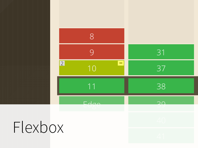
Another cool use of nth and last child selectors are what I’m writing about today, making a cool flexbox style responsive grid.
Why not just use flexbox?
CSS3 selectors work more consistently across a wider selection of browsers.
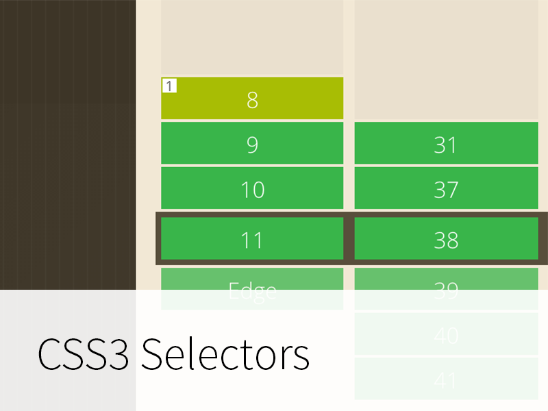
You can see the grid in action above, or see a finished product on codeschool.com.au , the size of the last child always scales to fill any extra space. We also use an nth-child grid for the template previews in outfit using the same technique covered in the article I linked earlier.
First child things first.
I’m sure everyone reading this knows what :last-child and :first-child are, but for the sake of the less experienced with css selectors, I’ll go over it.
:first-child is a pseudo-class that targets the first child of its parent.
For example:
li:first-child {
  color:#06a8f9;
}

<div>
  <li> first child </li>
  <li> list item </li>
  <li> list item </li>
  <li> list item </li>
  <li> last child </li>
</div>
would produce
- first child
- list item
- list item
- list item
- last child
because the first <li> is the first one in the parent div.
Alternatively, using :last-child would have a similar effect.
- first child
- list item
- list item
- list item
- last child
### Now that thats out of the way, onto the nth child.
Similar to first and last child selectors :nth-child is a way to select every element that matches the value of ‘n’.
For example, :nth-child(2) would select the second child of the parent element.
li:nth-child(2) {
color:#06a8f9;
}
- first child
- list item
- list item
- list item
- last child
Because we can use formulas as the ‘n’ value, instead of targeting just the second child, we can change (2) to (2n) and target every second child like this:
li:nth-child(2n) {
  color:#06a8f9;
}
- first child
- list item
- list item
- list item
- last child
If we combine this with :last-child we can target every second child but only if it is the last child of its parent.
- first child
- list item
- list item
- list item
- last child
As you can see, none of the children we were targeting were the last child of its parent, so none of them are affected. If we removed one of the items so a multiple of two was the last child of its parent you would see that child being targeted by our css.
- first child
- list item
- list item
- list item
This is how our grid layout will work. We will use code like this to apply specific css to the last child based on how many children the parent has.
Here’s an example of our css
/* if the last child is a multiple of two */

.li:nth-child(2n):last-child {
  color:#06a8f9;
}


/* if the last child is the one after a multiple of two */

.li:nth-child(2n+1):last-child {
  color:green;
}
- first child
- list item
- first child
- list item
- list item
- first child
- list item
- list item
- list item
Our grid will work exactly like this, but it will change the width of the last child instead of the color.
Ok, Lets get started.
I’m going to start out by creating three divs inside a parent div. and setting each of their widths to 33.33%.
All of the examples are hosted on codepen so you can have a look/play around with the
See the Pen LEKxqZ by John Morris (@Johnm__) on CodePen.
Now onto the magic stuff.
If I added another div right now, it would stack under the three divs and would only be 33% wide, leaving a big awkward 66% wide white space on the right of it.
Because our grid is 3 children wide and we wan’t to target the last child if its one after the last group of three, I’m going to use
:nth-child(3n+1):last-child to target that div and set its width to 100%
See the Pen EaBZmB by John Morris (@Johnm__) on CodePen.
Im going to do the same thing but change 3n+1
to 3n+2 to target the last child if there were two children after the last 3n and set it’s width to 66%
See the Pen Example three by John Morris (@Johnm__) on CodePen.
There you have it.
A grid that is aware of how many items it has and styles its self accordingly.
The sky really is the limit with this stuff.
If you come up with another cool use of, or way to implement any nth child layouts or tricks, we would love to see it. Get in touch with us on twitter.